Project
Abstract Season 2 Key Art
Disciplines
Art Direction
Description
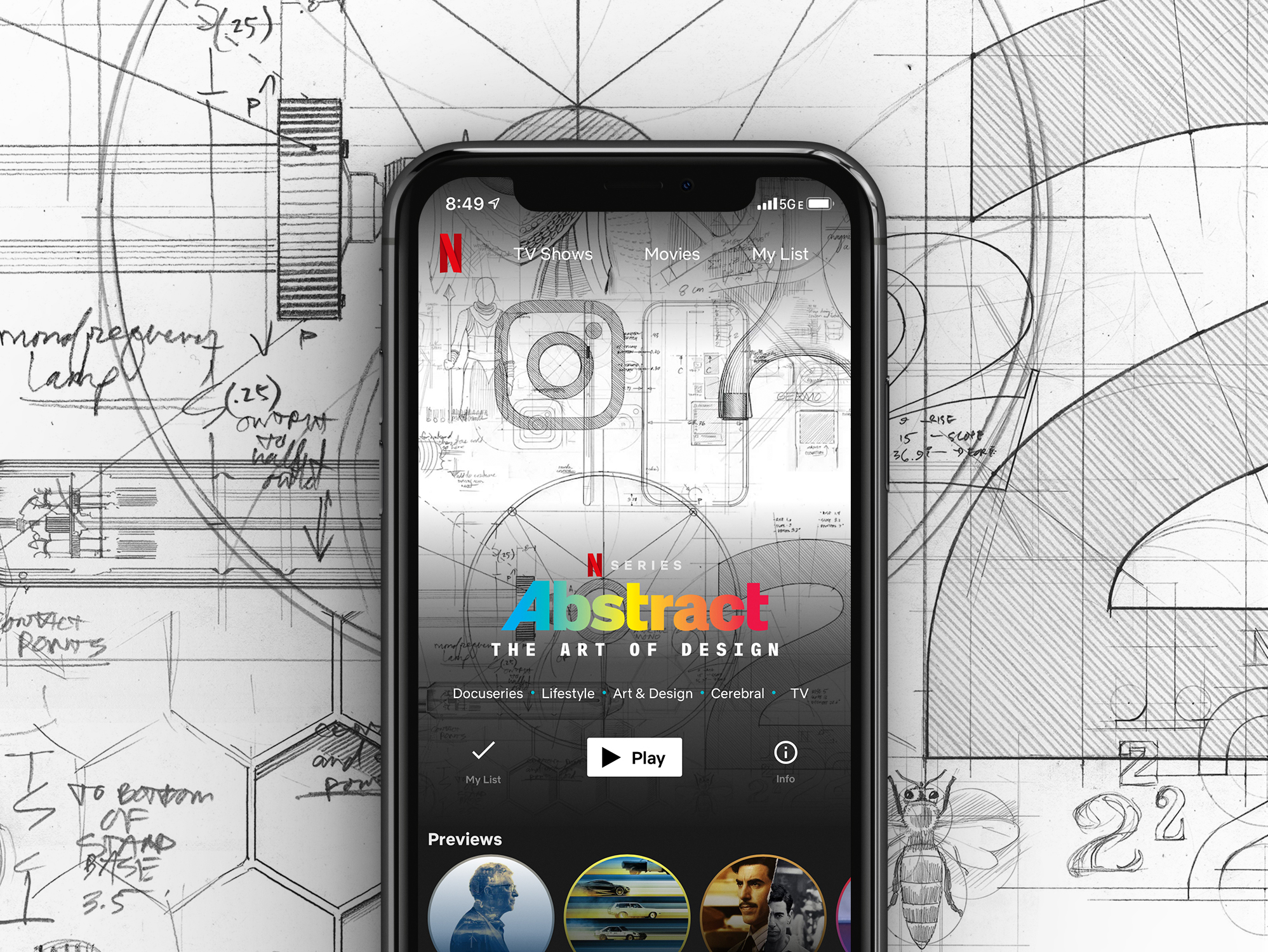
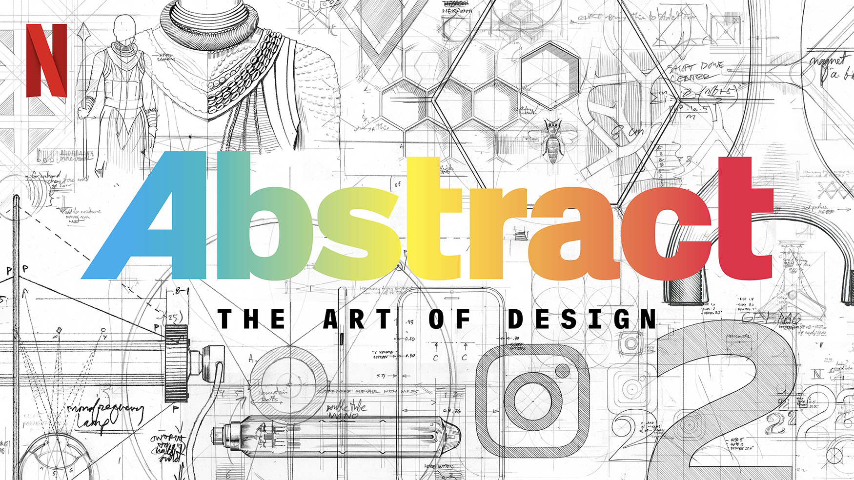
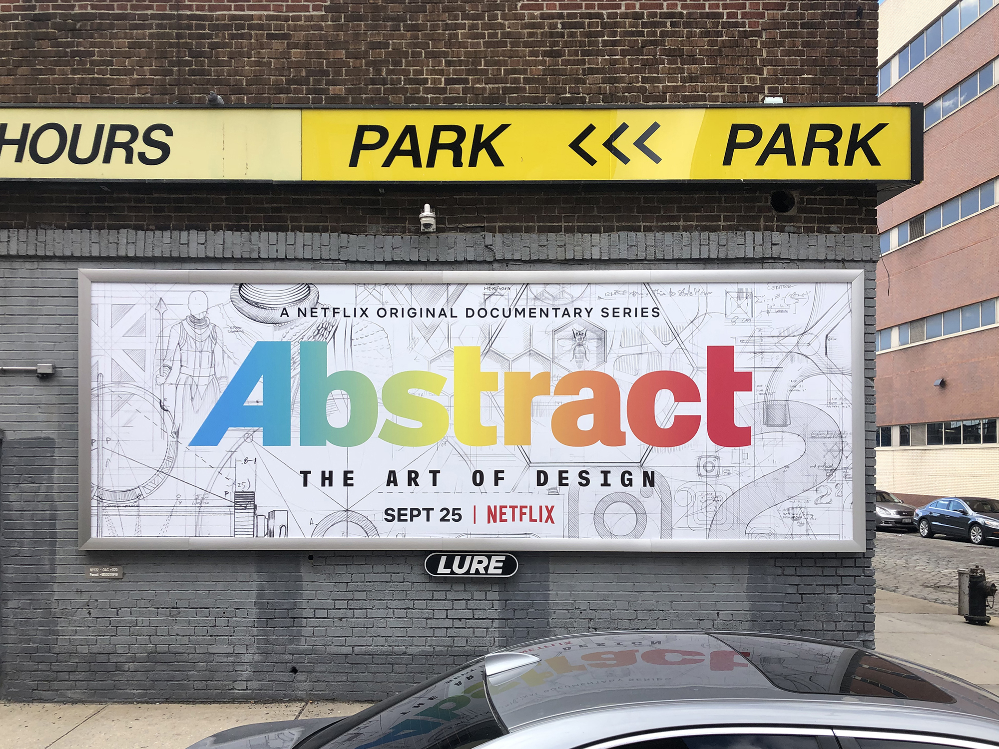
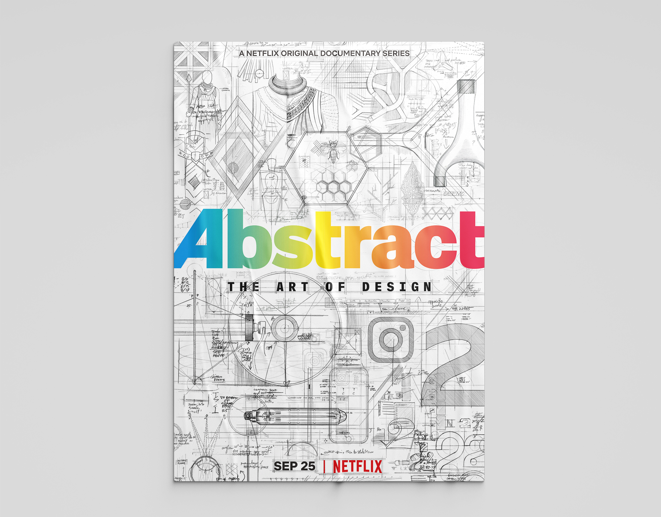
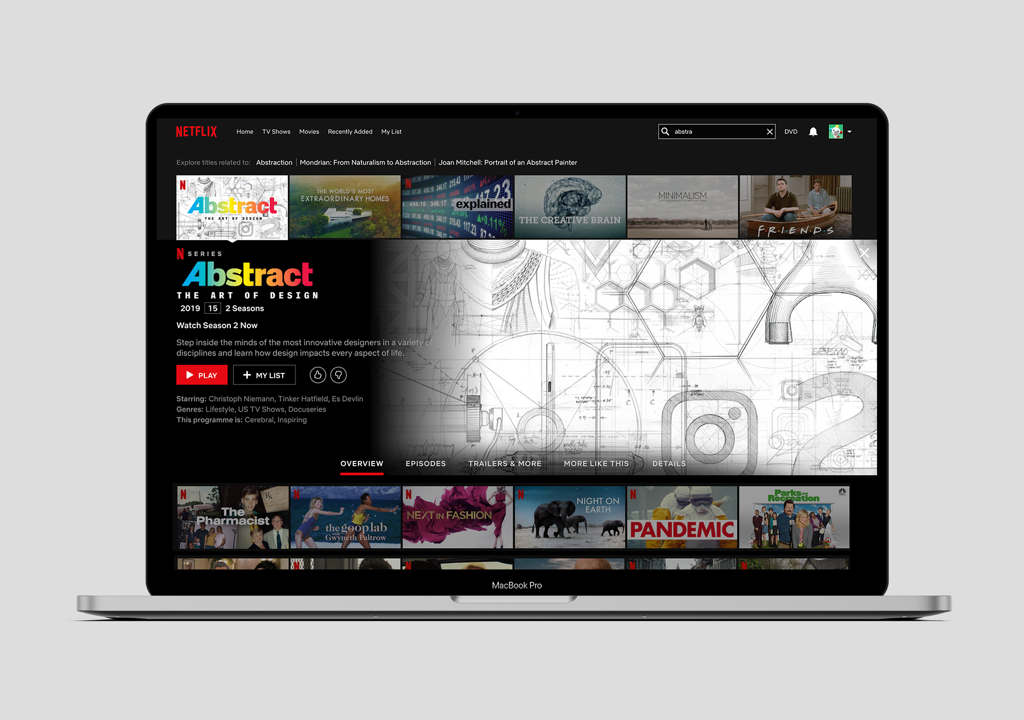
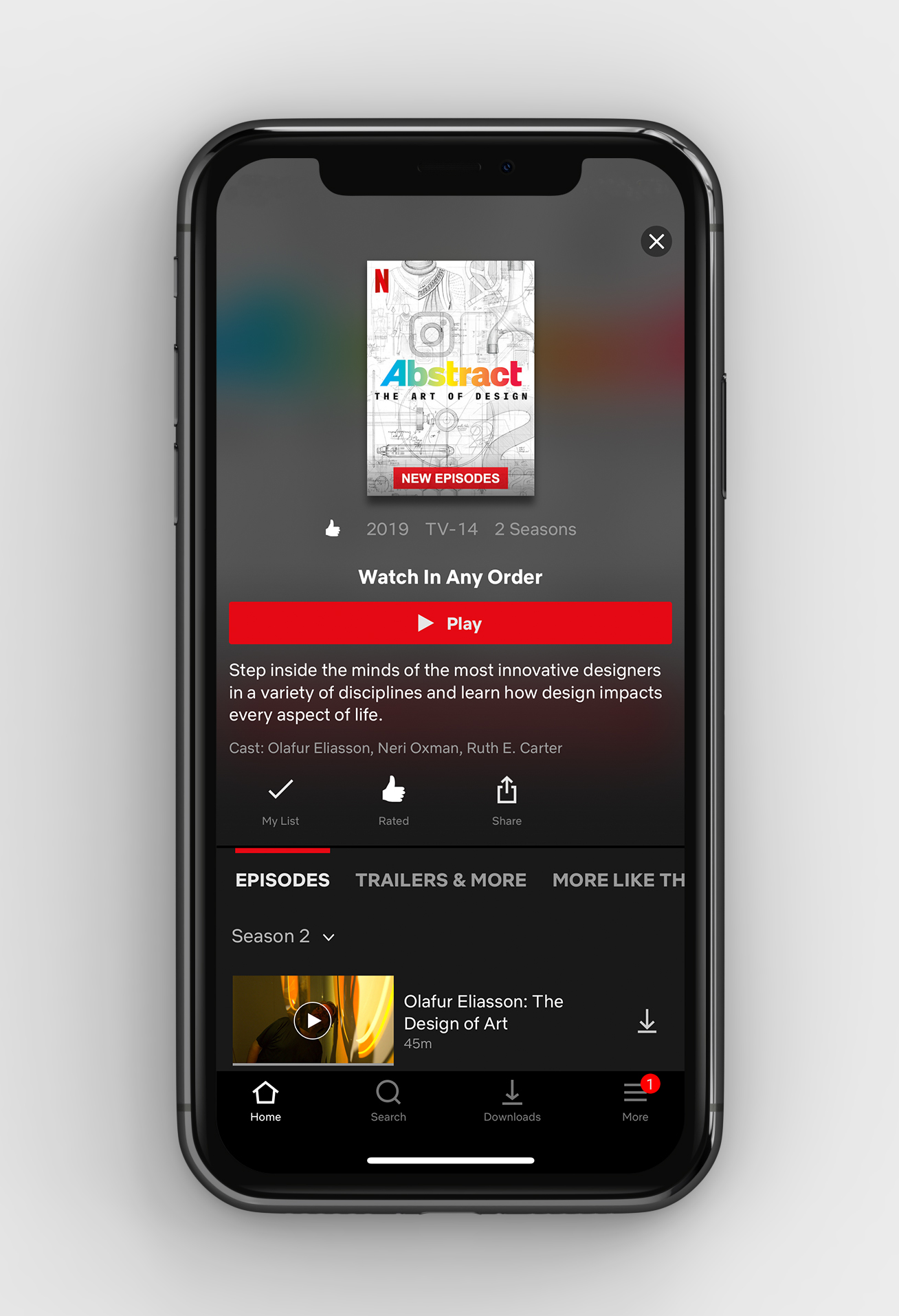
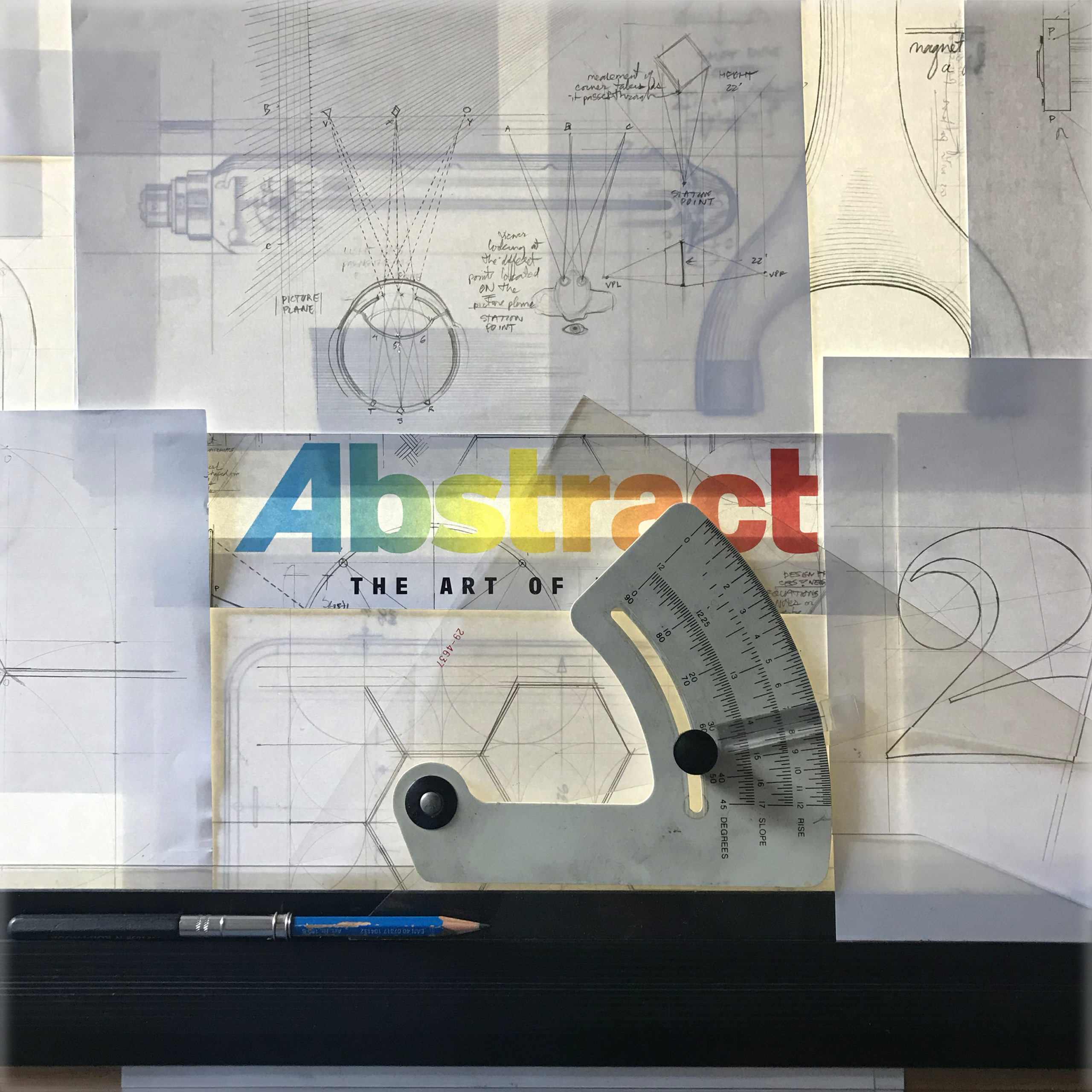
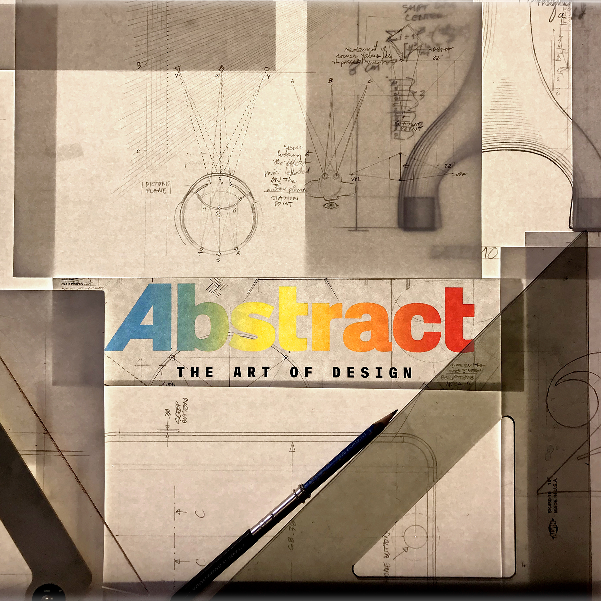
For the premiere of Netflix's Abstract: The Art of Design, the team at Godfrey Dadich Partners reenvisioned the series' key art. The key art needed to quickly communicate the theme of the show across Netflix's streaming app environment, on billboards, posters, and social media promotion. I lead the concepting and art direction for the project, working closely with illustrator Joe McKendry to execute a modular, hand-drawn approach that evoked the feeling of schematic, technical design notes. Within the schematic concept, we would feature notes and sketches that were emblematic of each designer featured in the show's second season.
Individual Environments
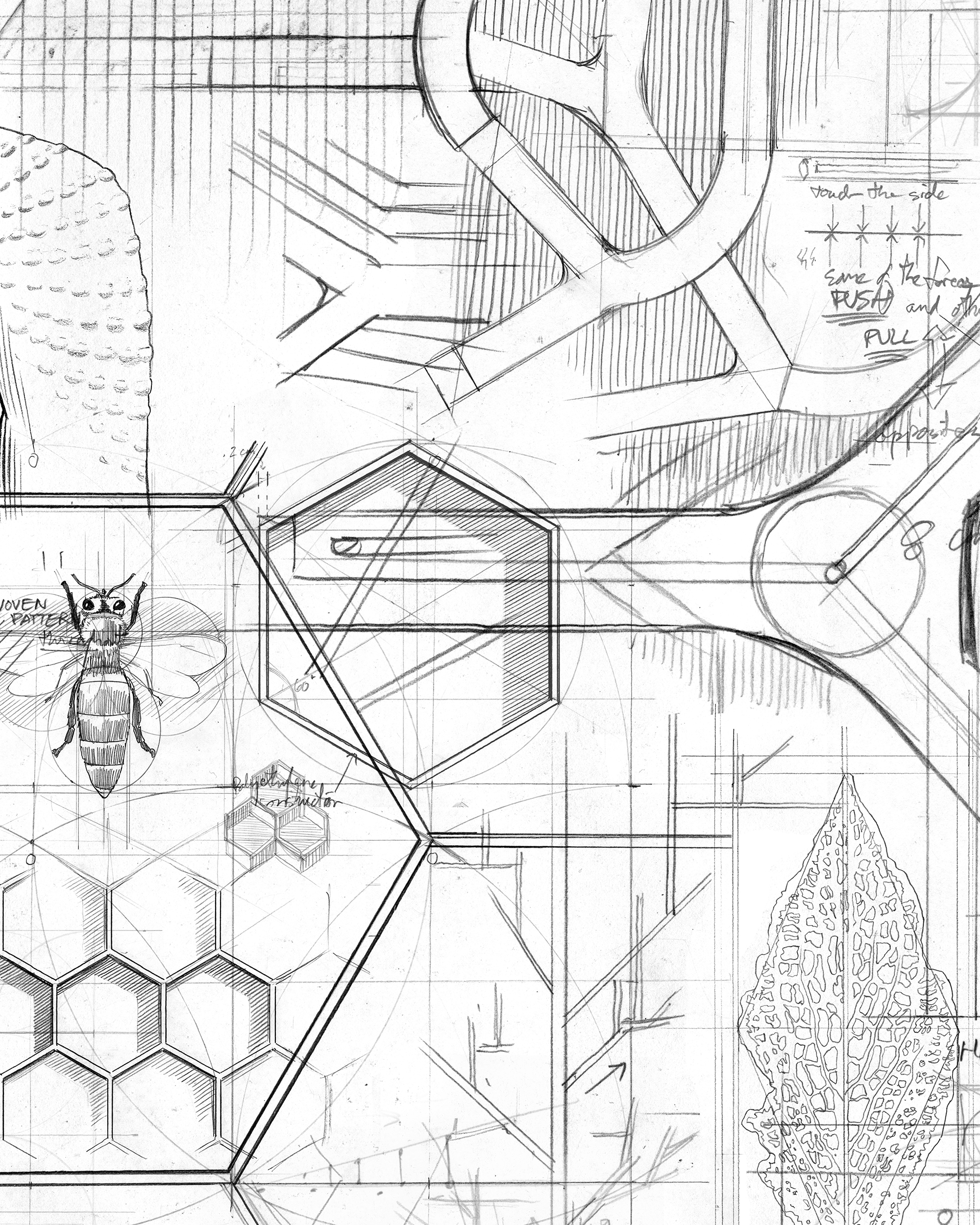
Cas Holman
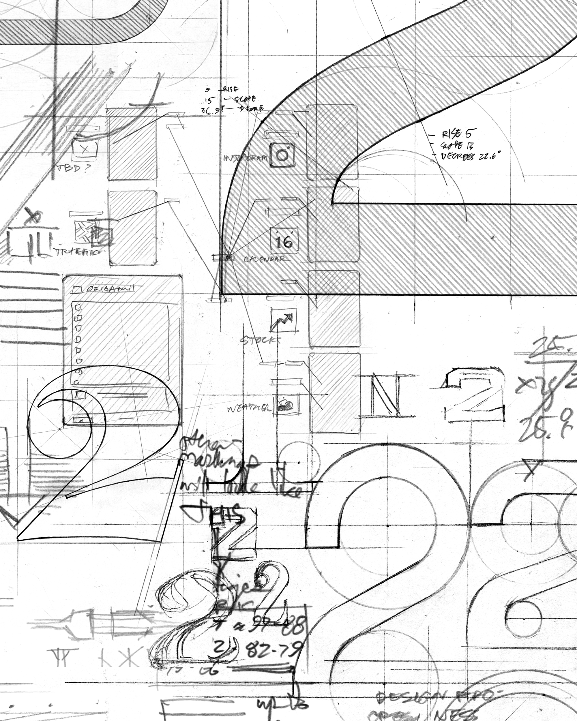
Ian Spalter
Neri Oxman
Olafur Eliasson
Jonathan Hoefler
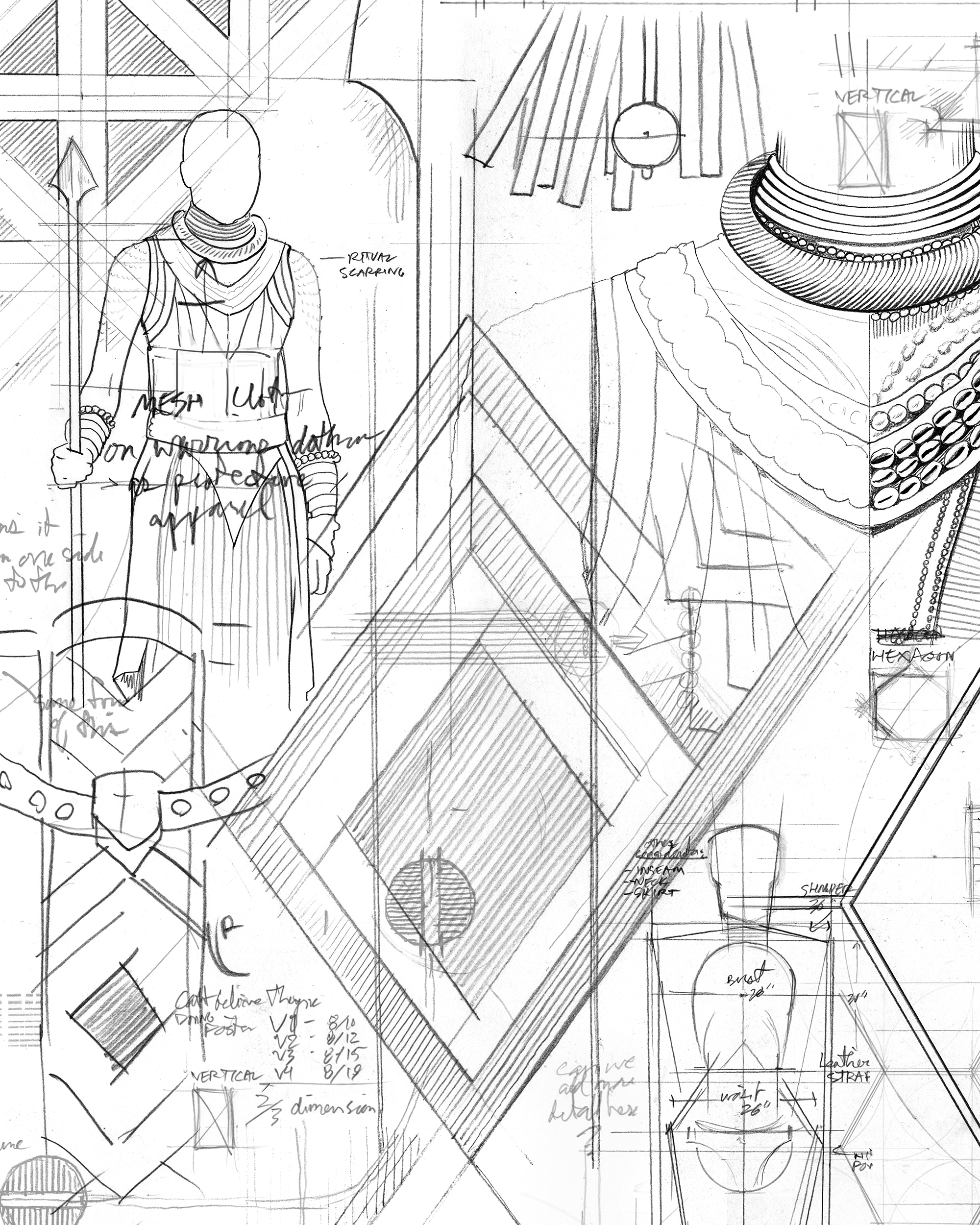
Ruth Carter
Social Content
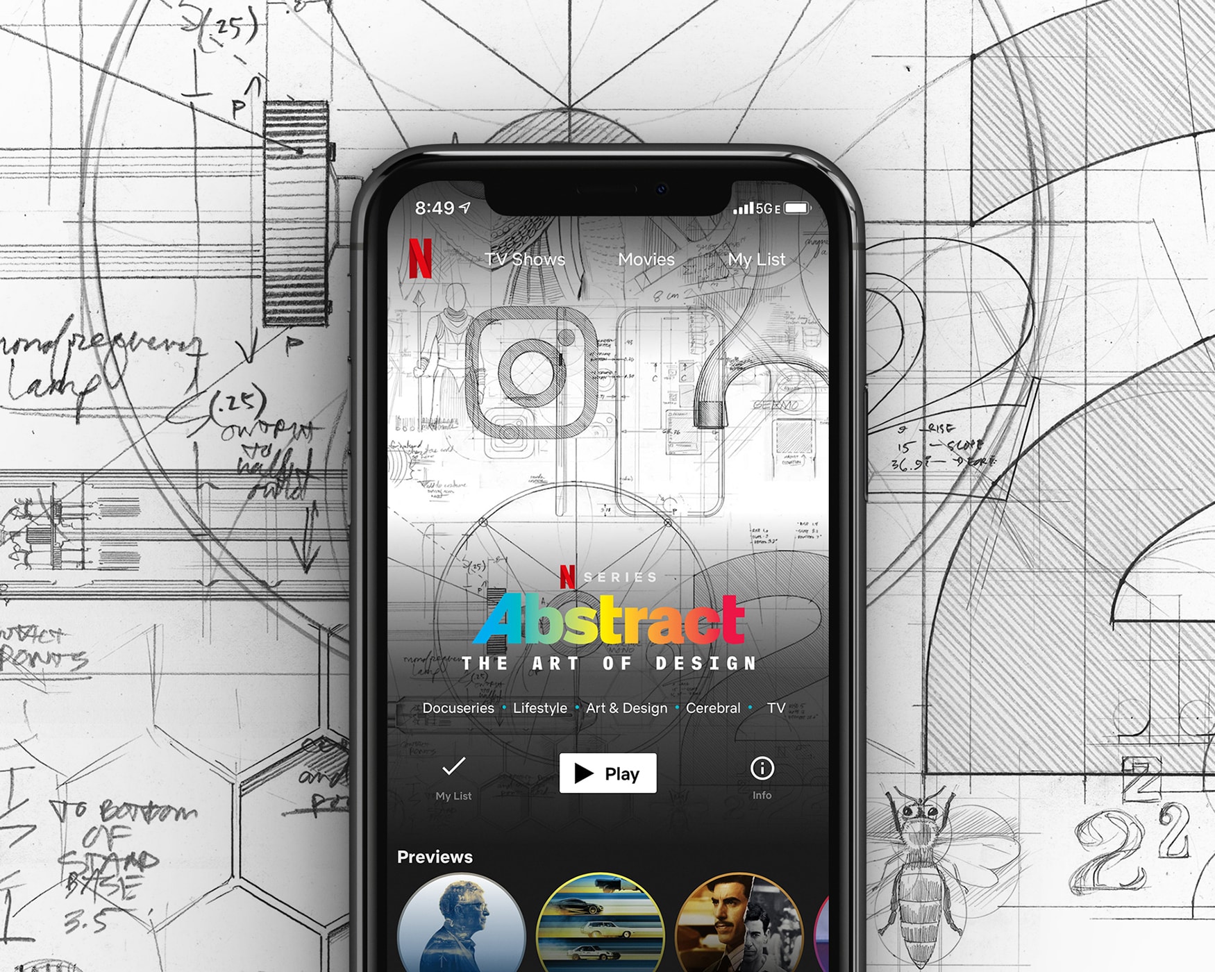
Along with the designing the key art for the show's release, our team also created content for, and managed Netflix's Abstract Instagram channel for the duration of the show. During this period, we drastically increased engagement, and grew the following from 50k to 115k+.
Process
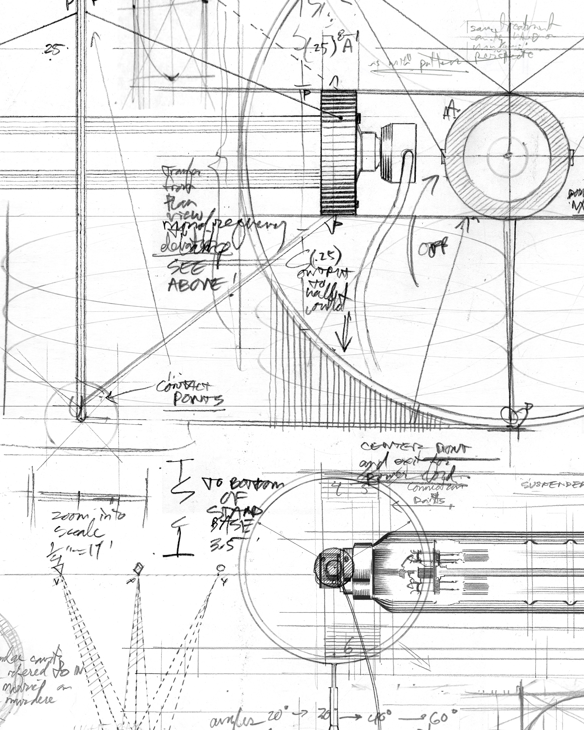
After pitching a breadth of concepts, the Netflix team decided on the hand-drawn, technical sketchbook feel of a direction we titled "Meta", referencing the conceptual evolution from the season one poster. We liked the idea of shifting the artwork’s overall color tone from the iconic black backgrounds of season one's key art to white. The flat lay objects from season one would be drawn by hand, to speak to the intensive design process, while bringing three-dimensions into one, a reference to the paper on the page of an empty sketchbook.
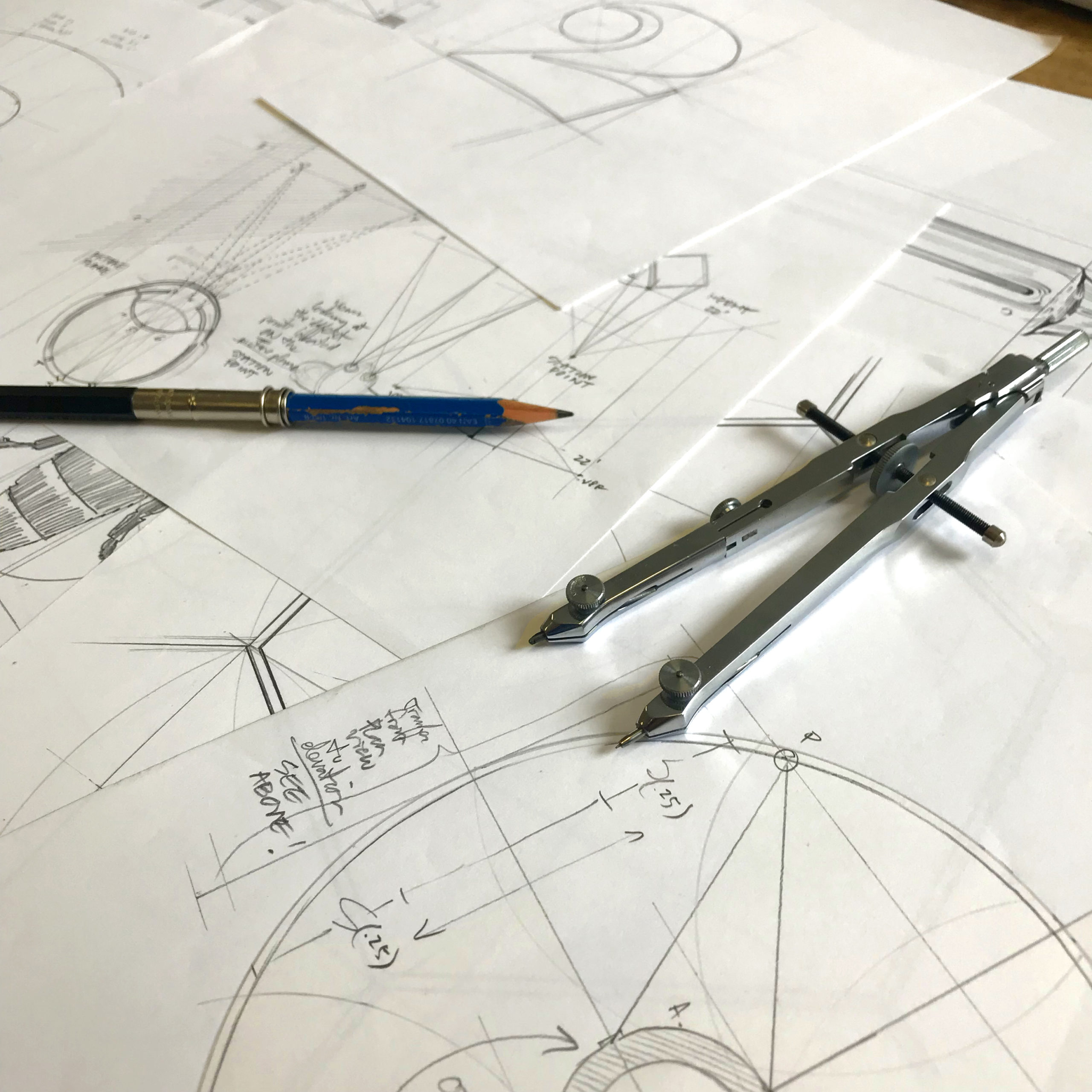
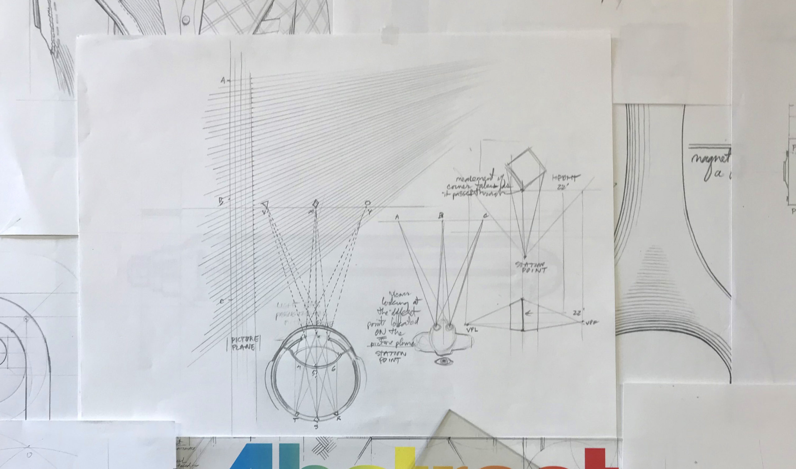
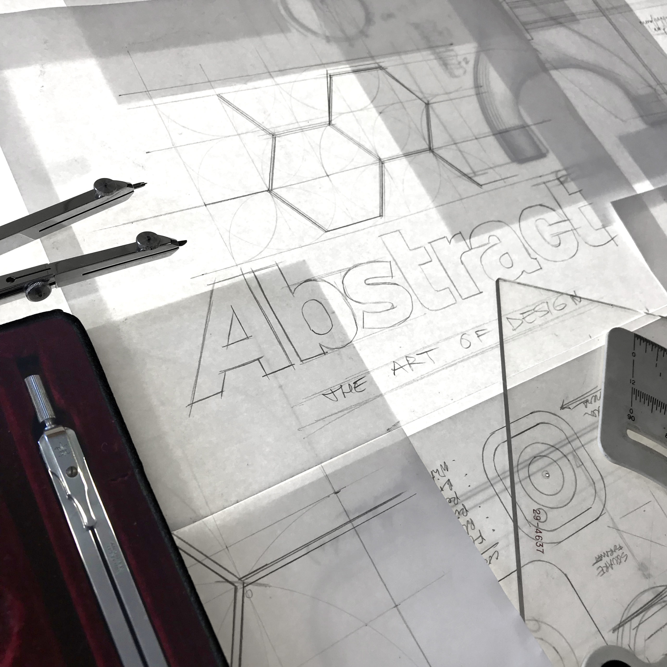
We selected illustrator Joe McKendry based on his detailed work for editorial publications, and background in rigorous, immaculately detailed illustrations. I created a rough concept poster, selecting a set of objects to represent each designer featured in the show. Then, I laid them out on the poster, giving each designer a respective area, while identifying moments of overlap to allow the composition to flow together. Scale, density, and perspective were crucial to making the artwork successful in a variety of formats.
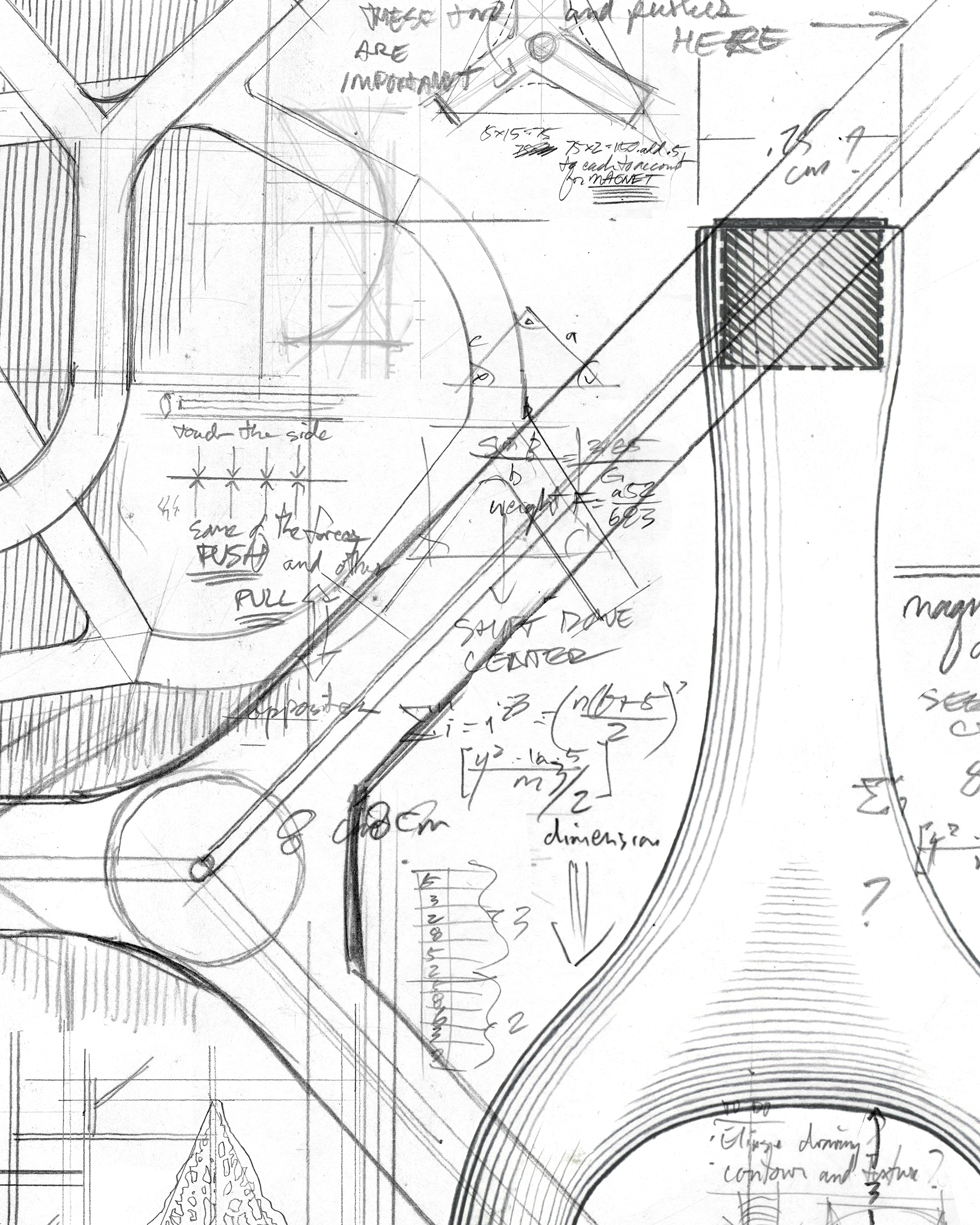
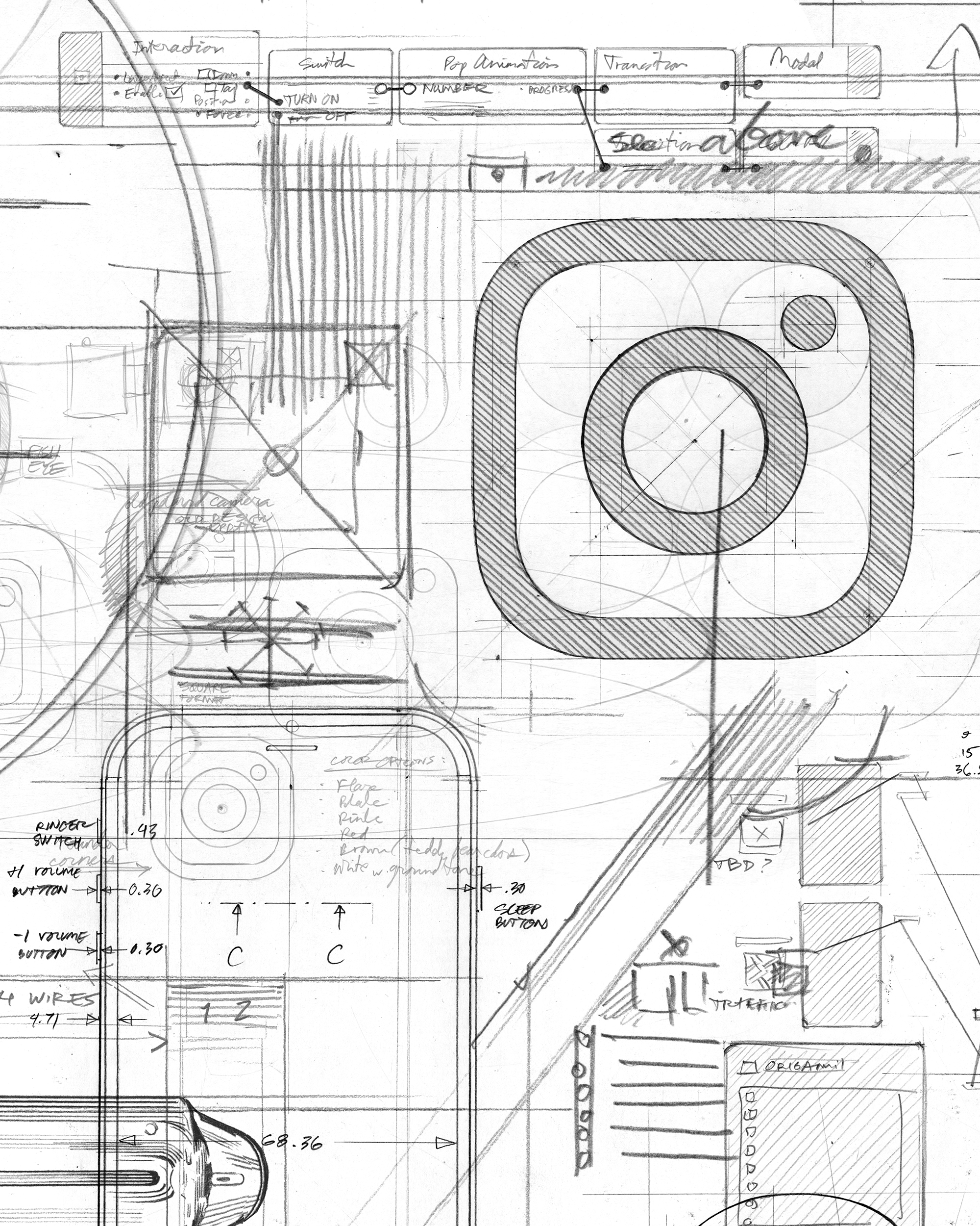
Joe set out to create each individual drawing with pencil, paper, and a set of analog drafting tools that he inherited from his grandfather. I worked closely with Joe to ensure that we developed a cohesive set of objects that could break apart and fit back together in a modular way and would accommodate vertical and horizontal compositions with varying amounts of overlay text.
Once the artwork was finalized, we digitized the compositions and worked with the Netflix team to carefully reformat each application of the artwork. Finally, we localized the key art, translating the treatment in over 20 languages for Netflix subscribers around the world.
Role: Art Direction, Design
Illustration: Joe McKendry
Creative Direction: Rachel Gogel, Scott Dadich
Selected Works
Netflix - Abstract S2 Key ArtArt Direction
Zillow - ZimplifiedArt Direction
Joe Coffee Company - Brand Identity & PackagingArt Direction, Packaging Design, Brand Design
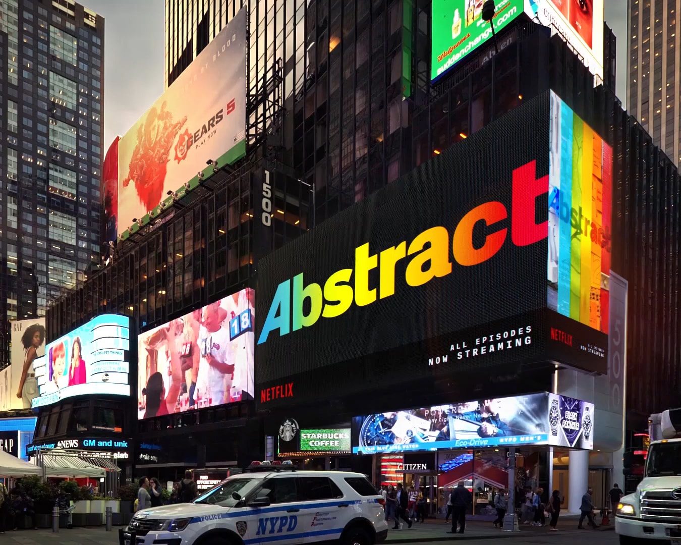
Netflix - Abstract S2 Times Square BillboardArt Direction
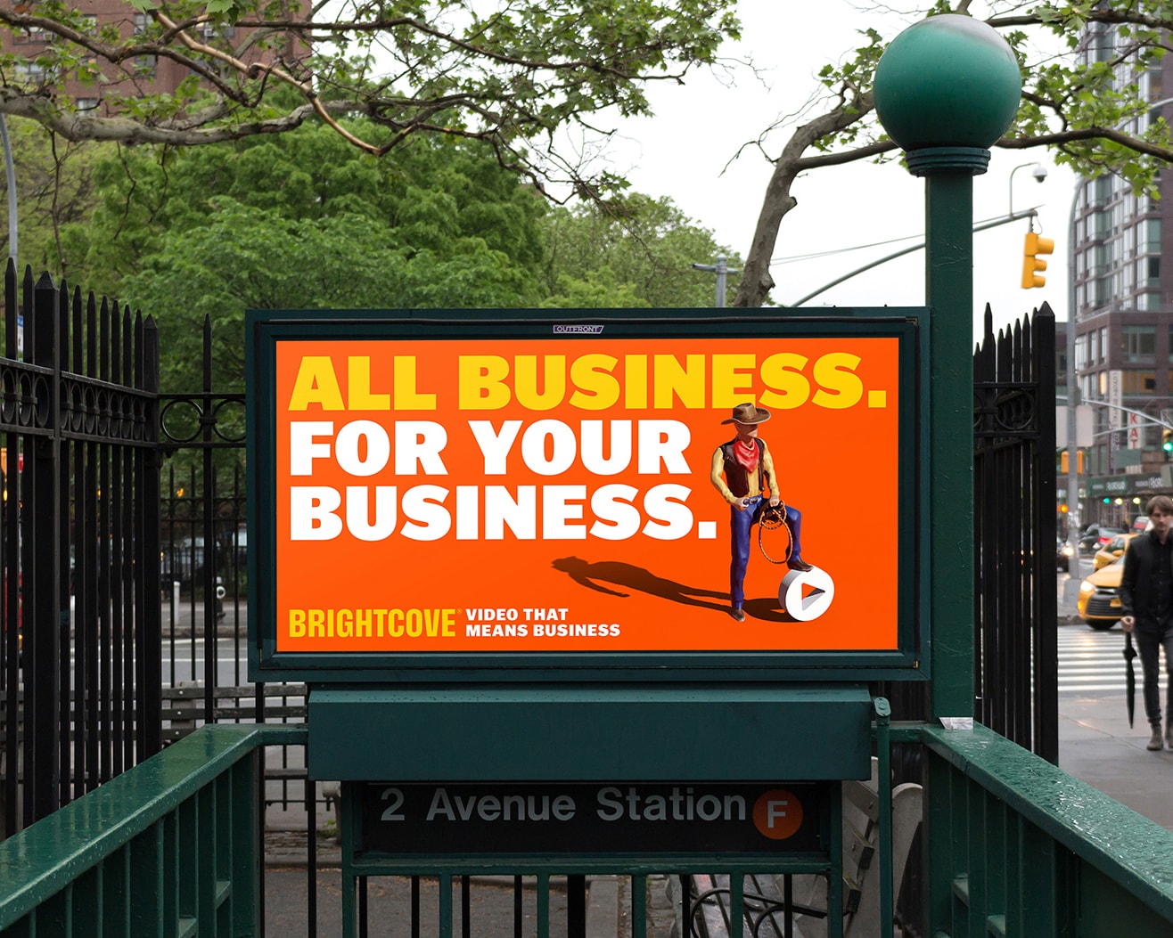
Brightcove - Brand Refresh CampaignArt Direction, Design
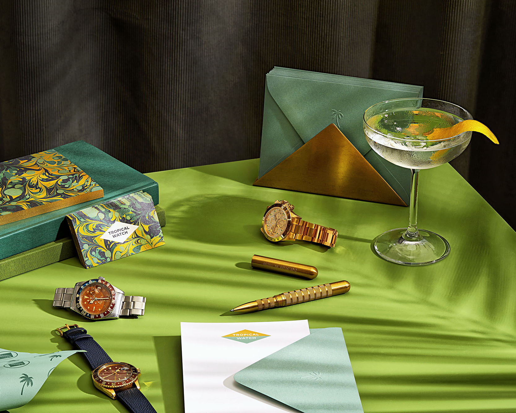
Tropical Watch - Brand Identity & WebsiteWeb Design, Brand Identity
The Joshua Tree House - Brand IdentityBrand Identity
Palo Alto Networks - Prisma Launch CampaignArt Direction

OpenTable - Consumer Email RedesignEmail Marketing
The Assembly - Brand IdentityBrand Identity
Cold Water Vinyl ReleaseAlbum Art
OpenTable - Arepas & AgaveEvent Branding
Send all project inquiries, secret family recipes, stock market tips, and new music suggestions to: