Project
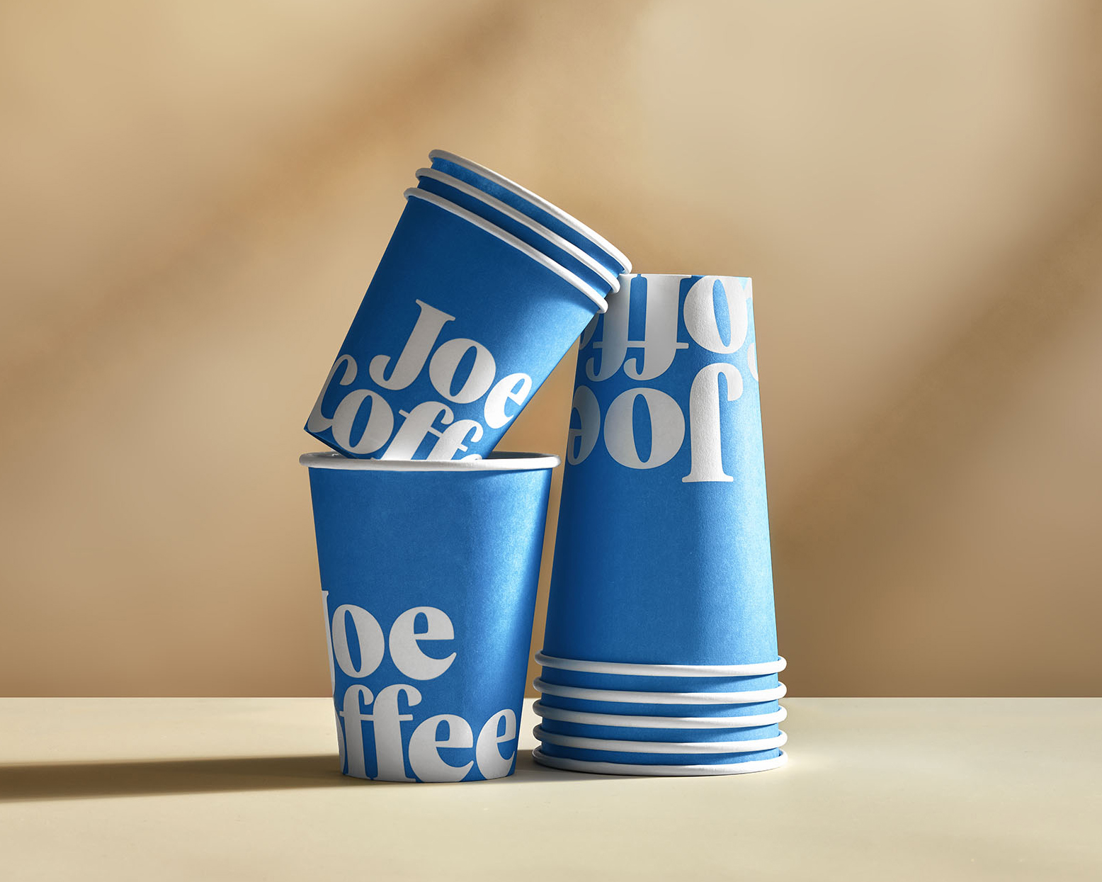
Joe Coffee Company
Disciplines
Art Direction, Brand Identity, Packaging Design
Description
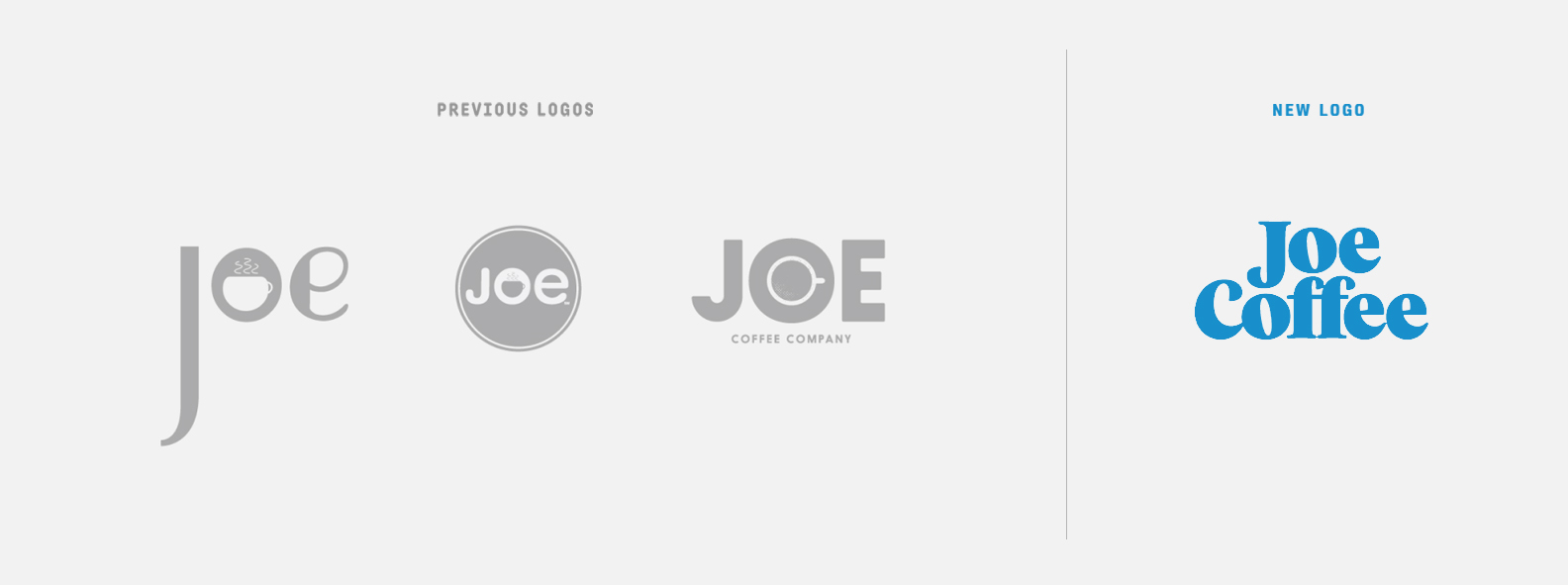
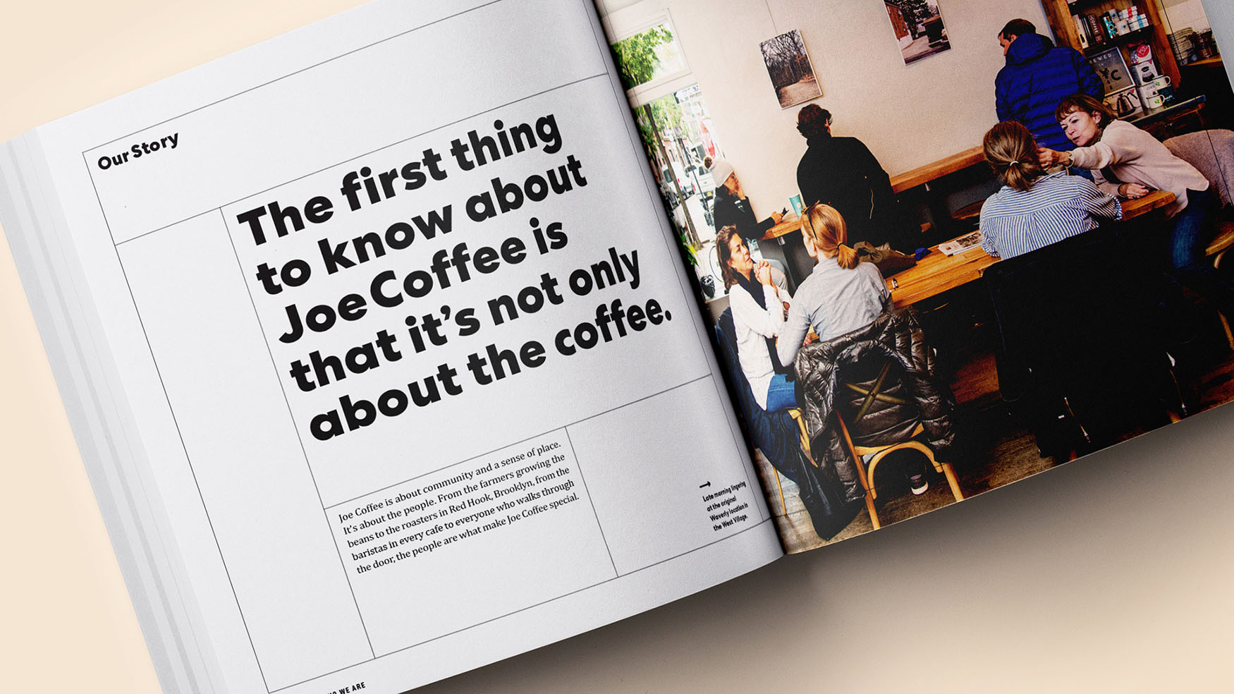
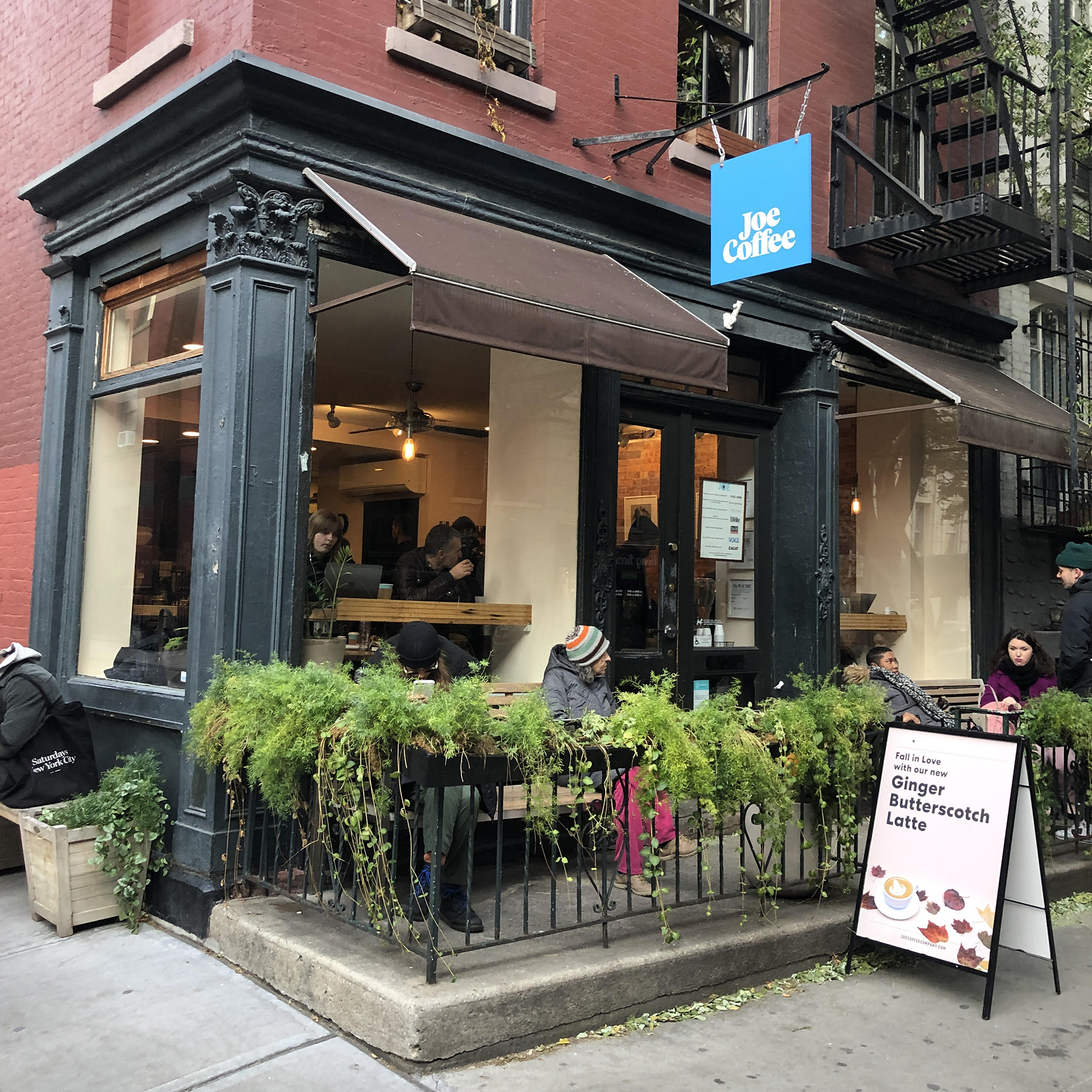
Joe Coffee Company is an institution in the NYC coffee scene, credited by some as bringing third-wave to the city. A recent investment from Danny Meyer's Union Square Hospitality Group, who invested in Shake Shack, Union Square Cafe, and Gramercy Tavern, planned to take the beloved neighborhood fixture to the national stage. The founders approached the team at Godfrey Dadich Partners for a complete rebrand that would maintain the friendliness and warmth of Joe’s customer experience, with just enough “New York swagger” to stand out in a crowded market.
"The new packaging feels...like a custom, ownable identity that very nicely plays up the name of the roaster. The shades of blue are well balanced and put to use very well on the labels. The cups and merch look great with the logo applied extra big. Overall, an attractive and energizing redesign." - UnderConsideration

Applications
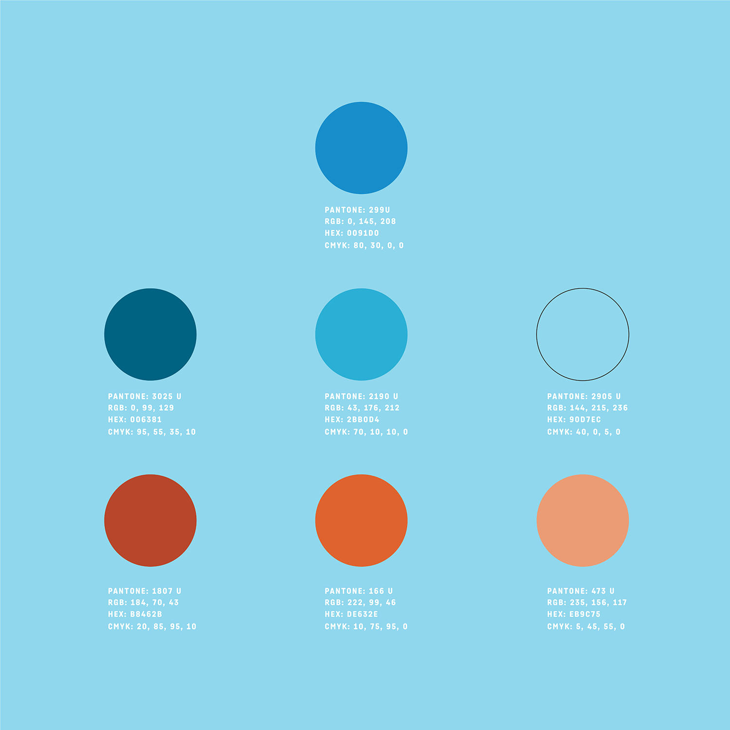
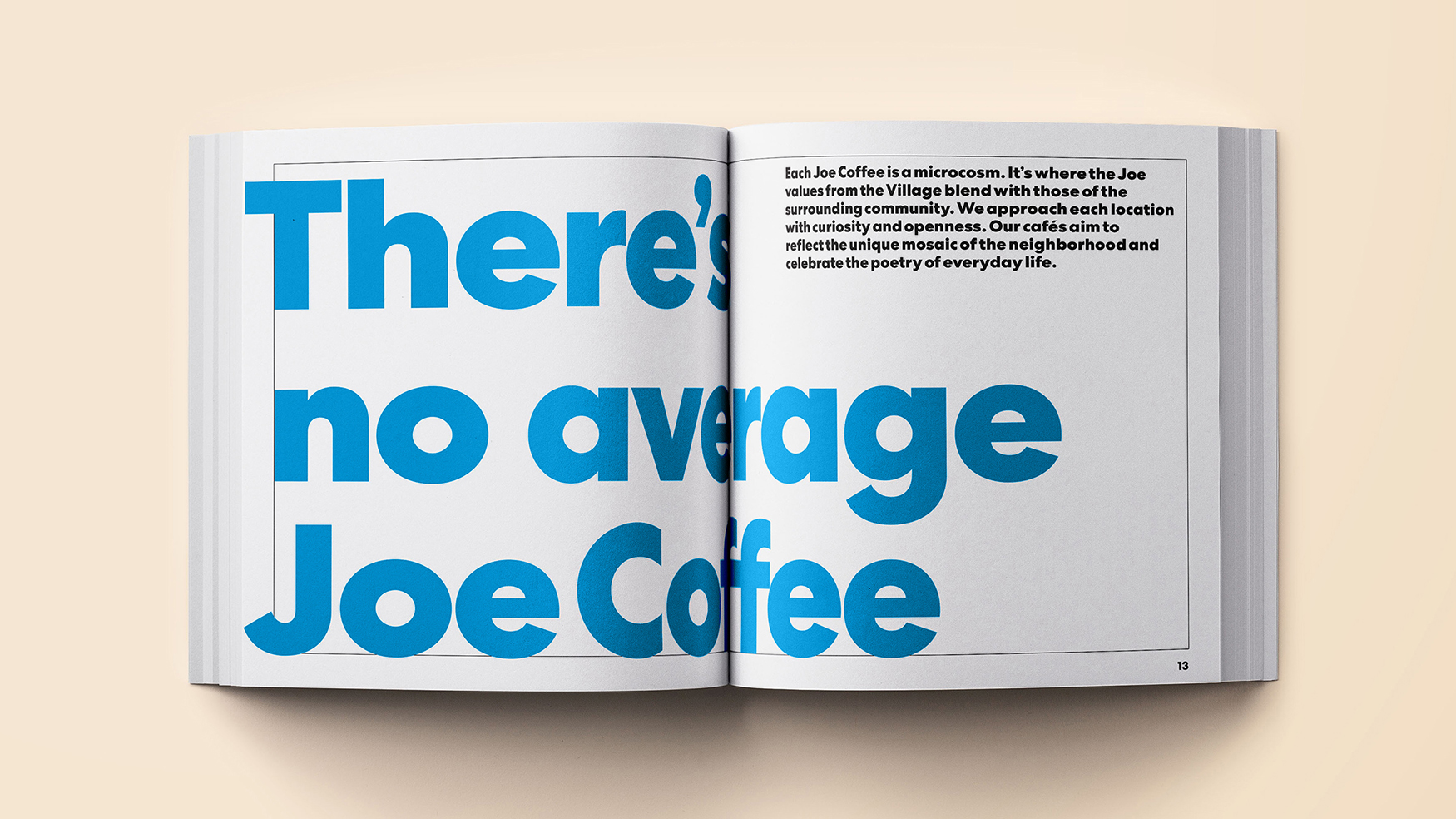
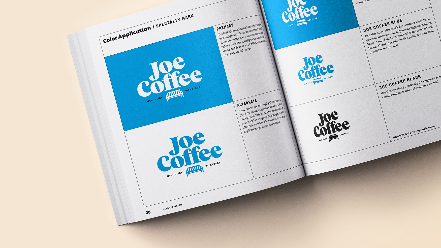
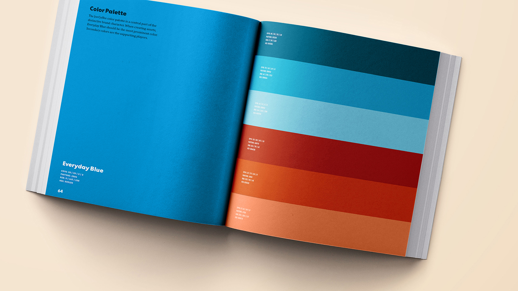
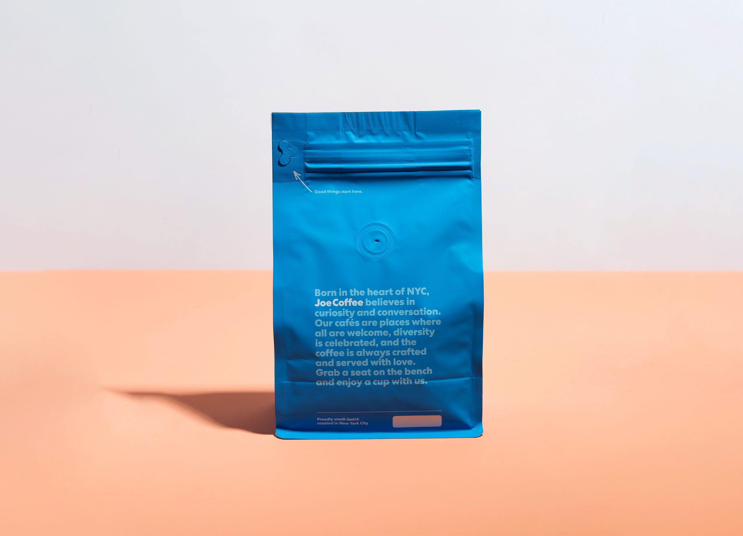
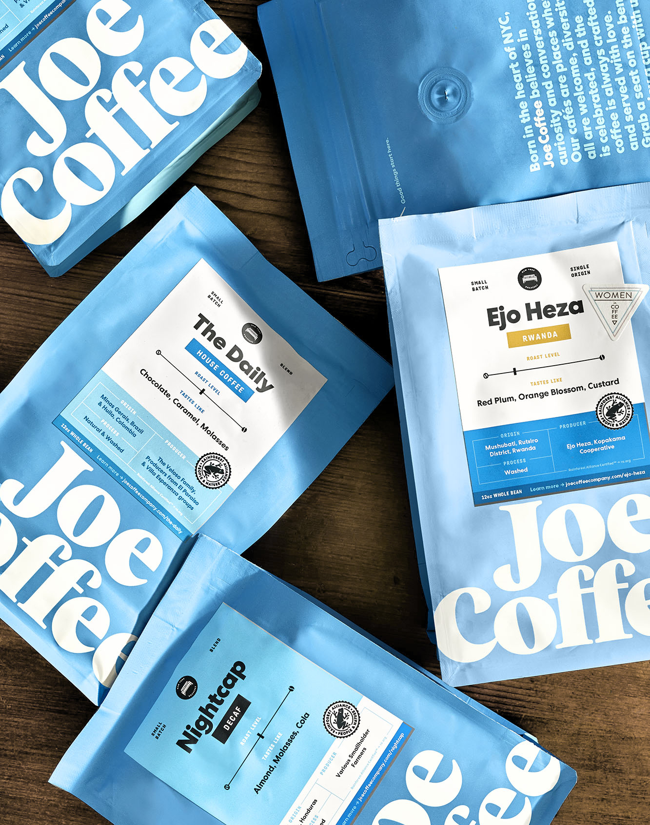
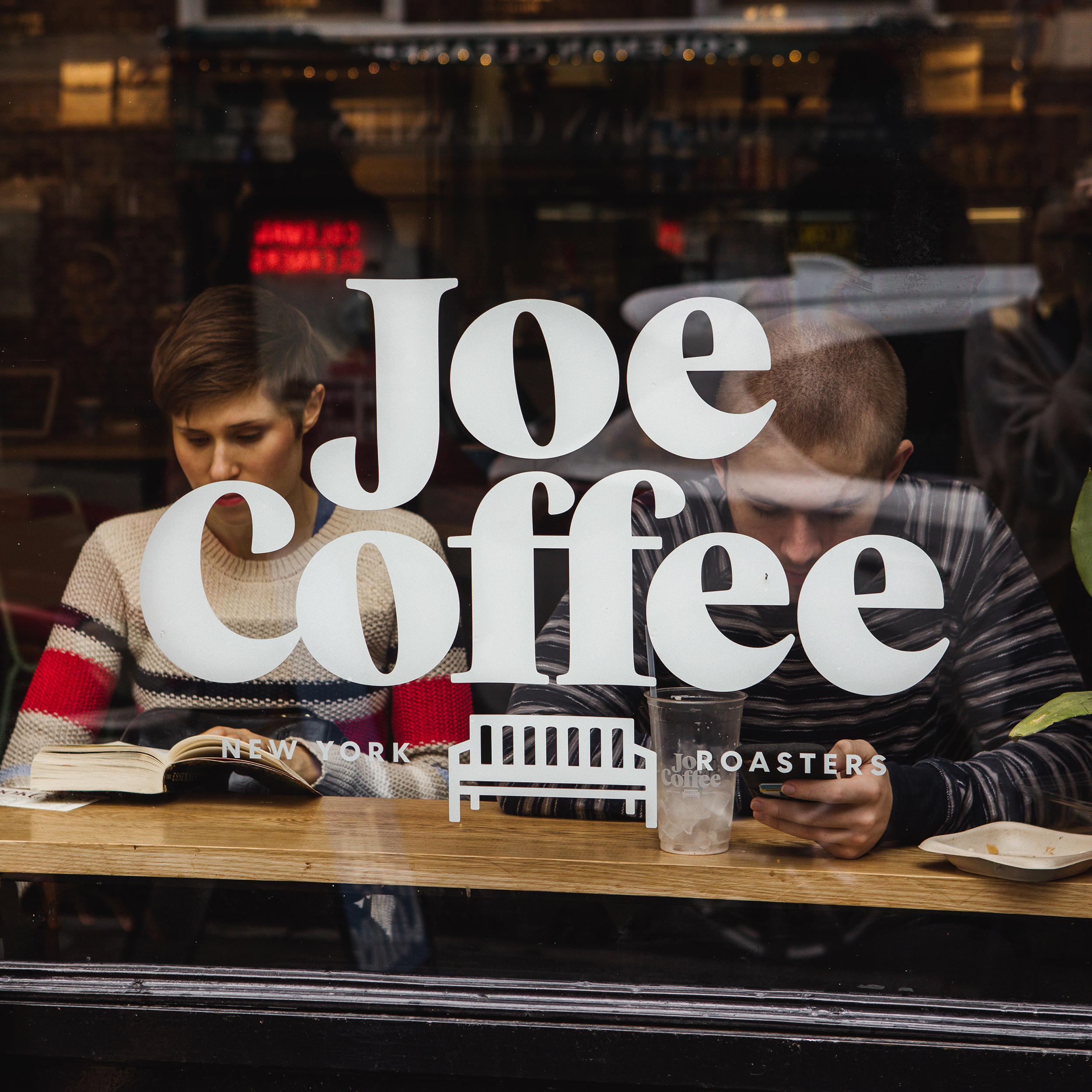
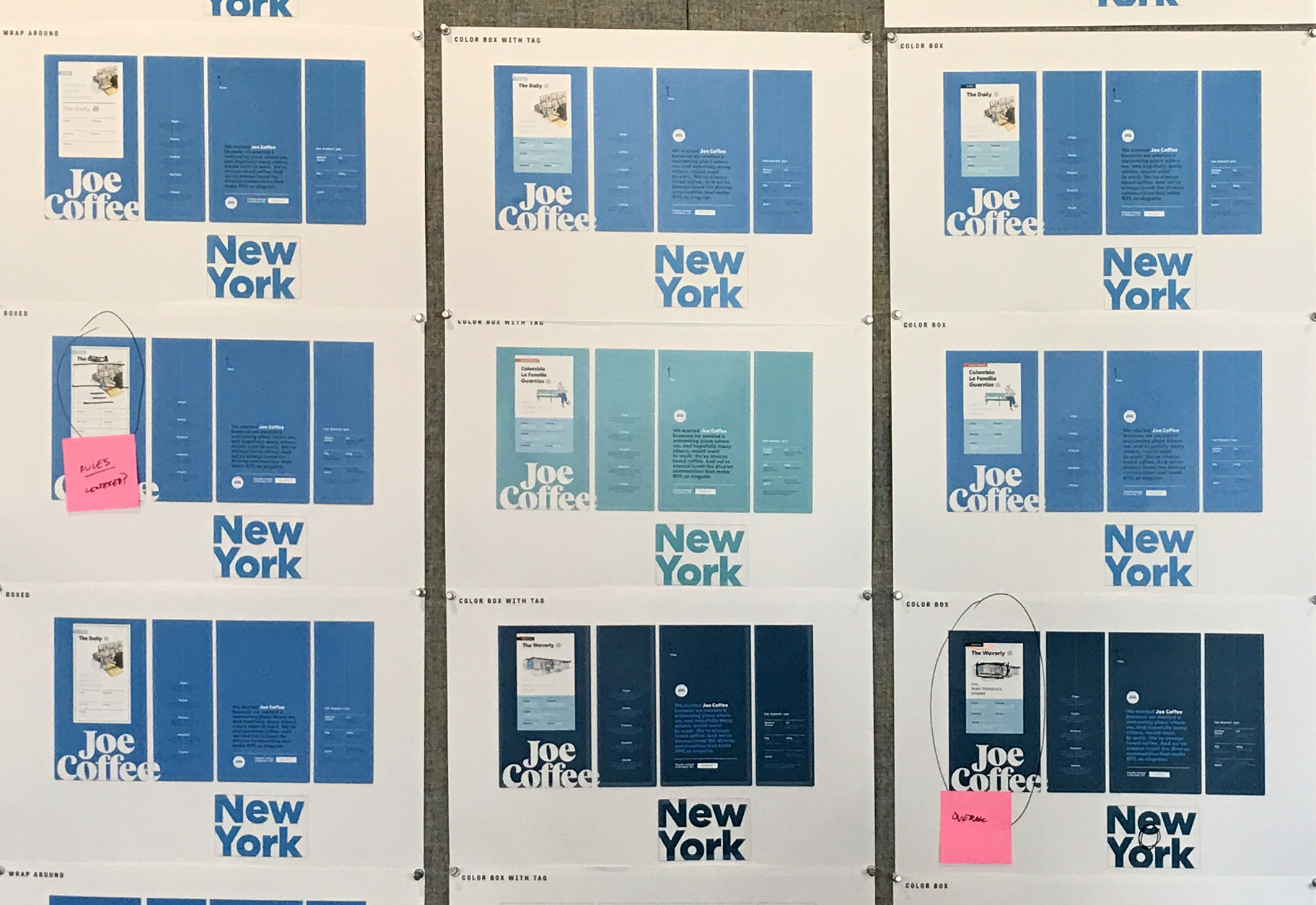
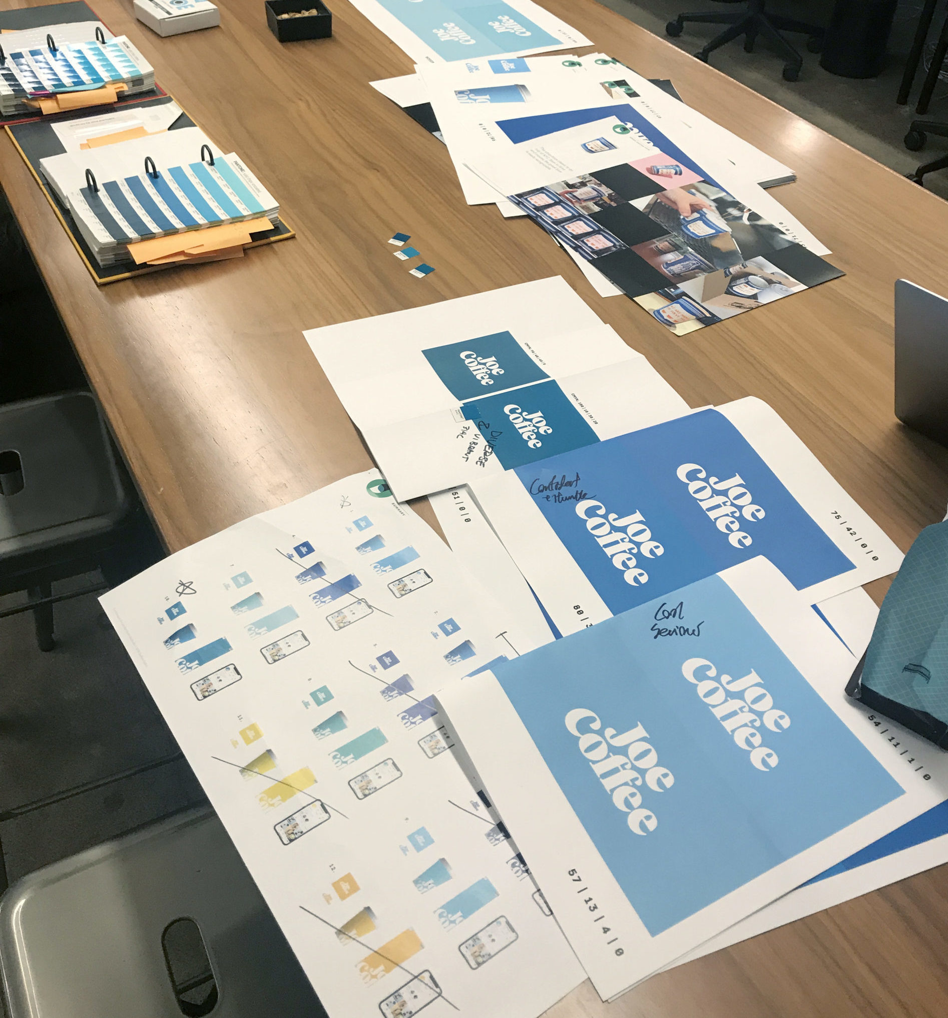
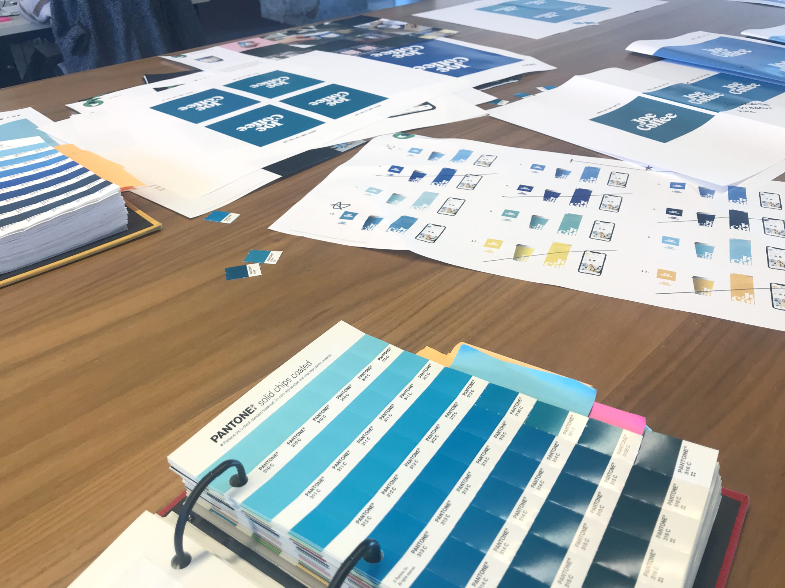
The color system for the company needed to build on the legacy of the traditional light blue, while bringing in more energy and flexibility. We chose to create three tonal blue primaries, with the middle blue being the ownable core brand color. The iconic bench featured in our branding is a nod to the benches which can be found in front of every Joe Coffee shop. The bench represents the communities built up and united around the shops.
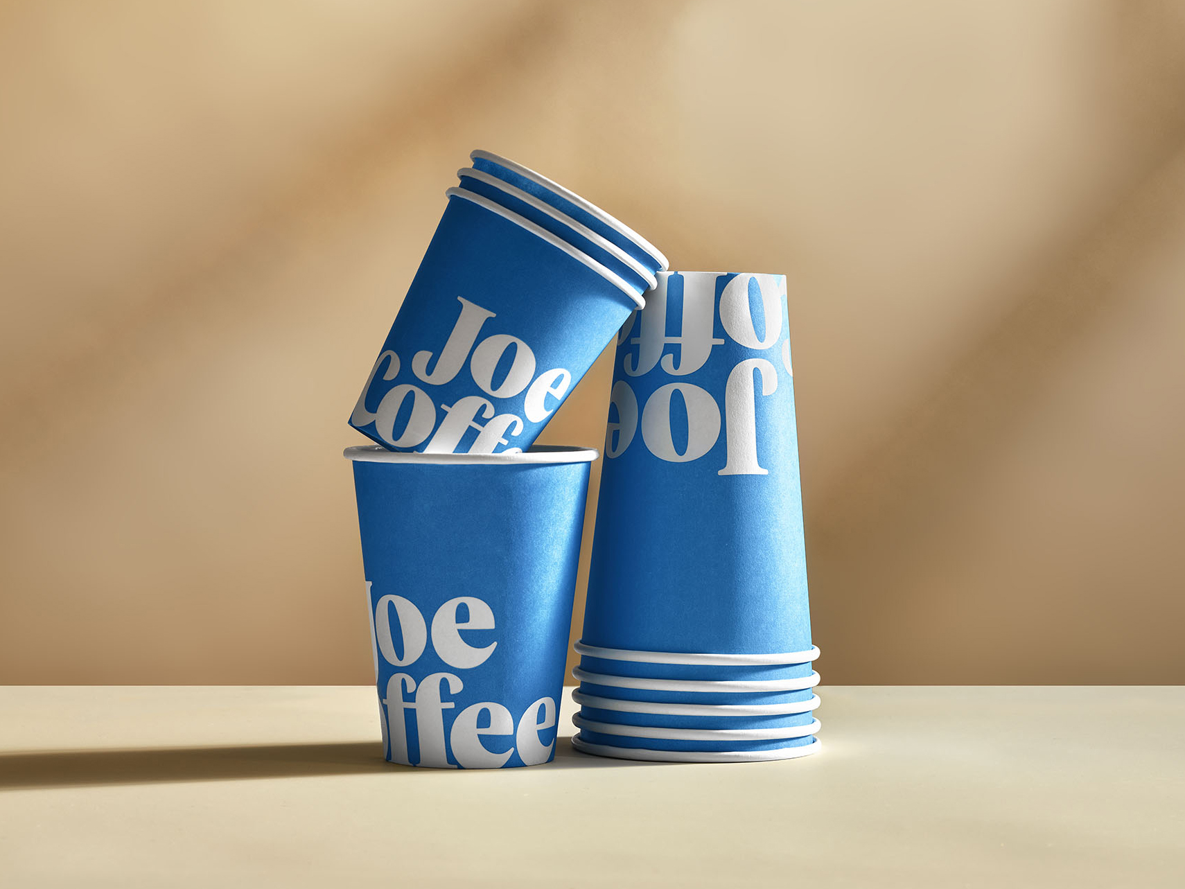
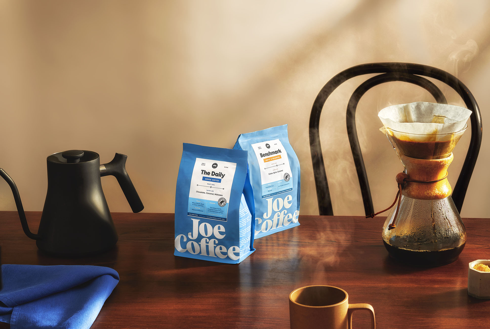
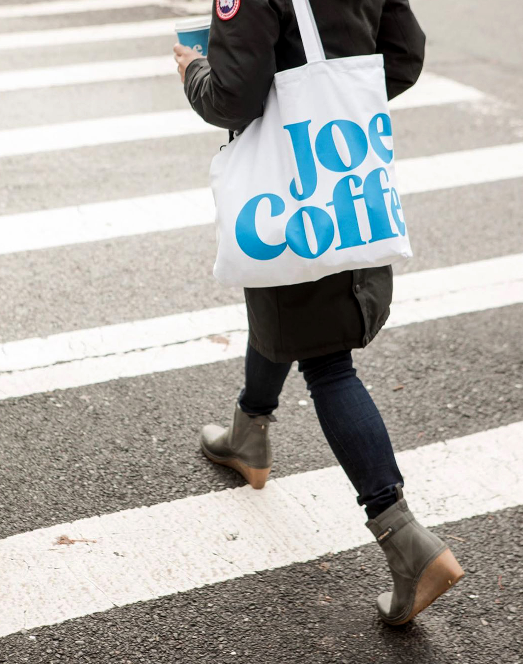
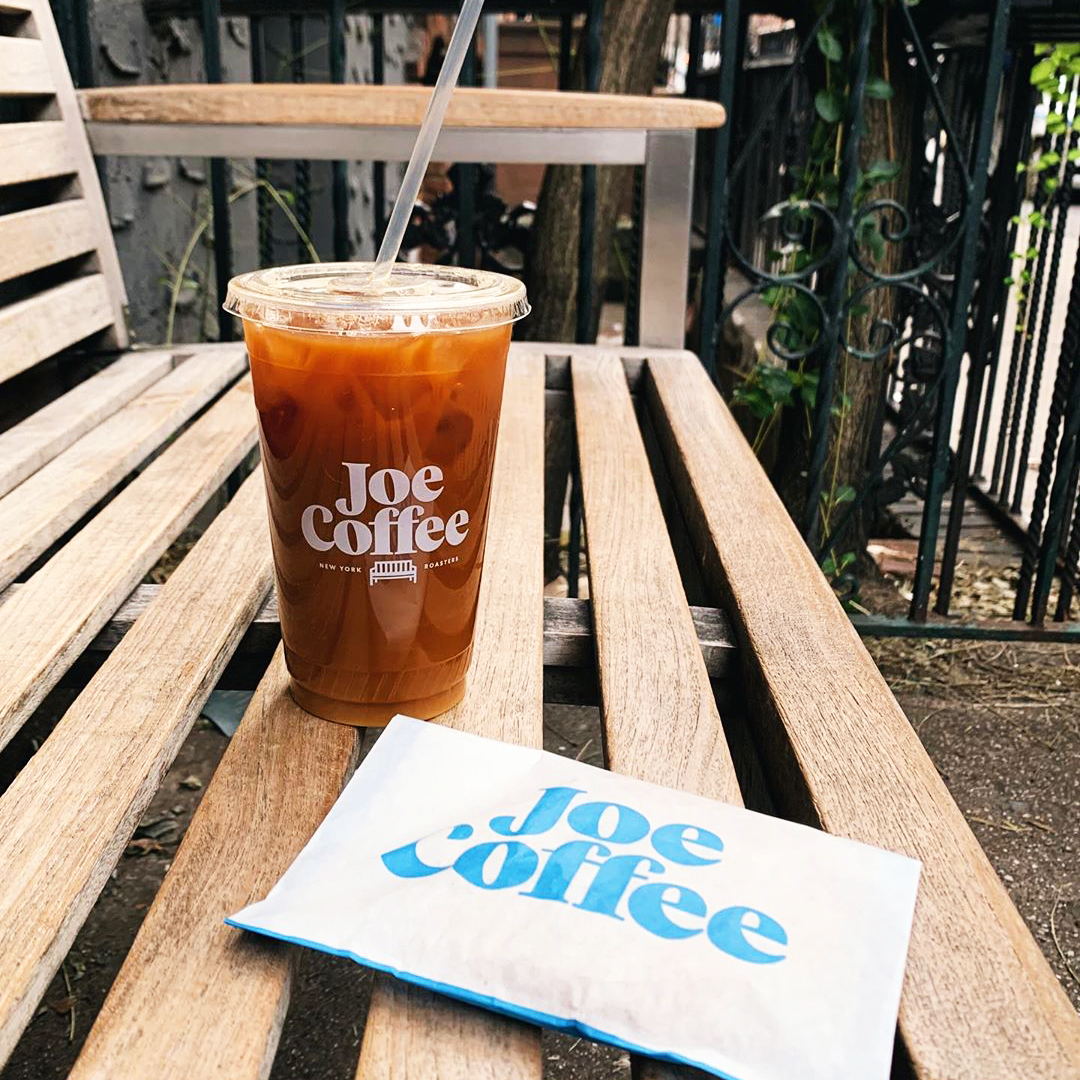
Coffee bags and coffee cups are a primary marketing touchpoint for coffee brands, often being photographed and shared via customer's social media feed as part of their daily ritual. We kept this in mind as we built out the simple, brand-forward bag, and cup system that would quickly build equity in the new logo and colors, while standing out on the street in a crowded coffee marketplace.
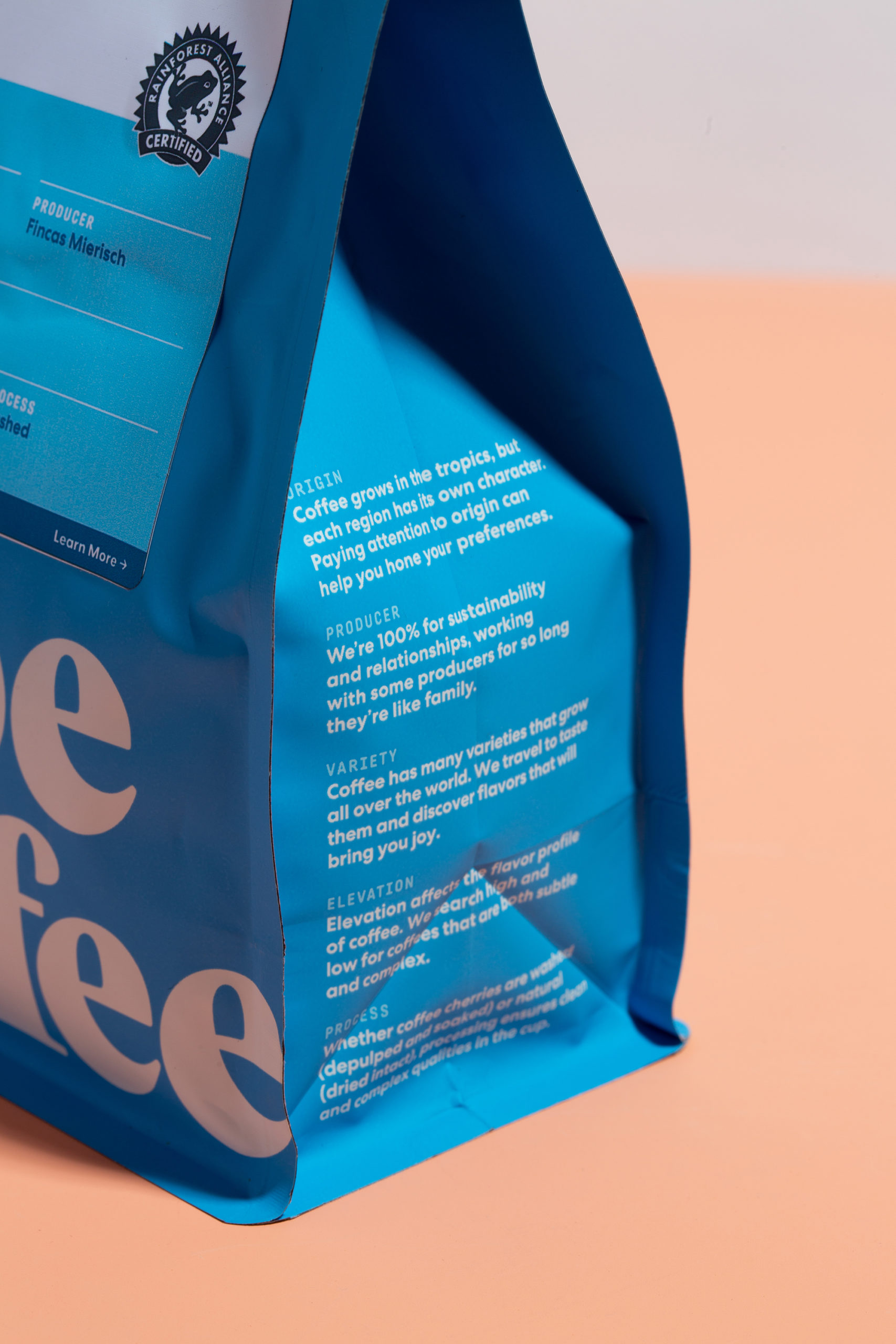
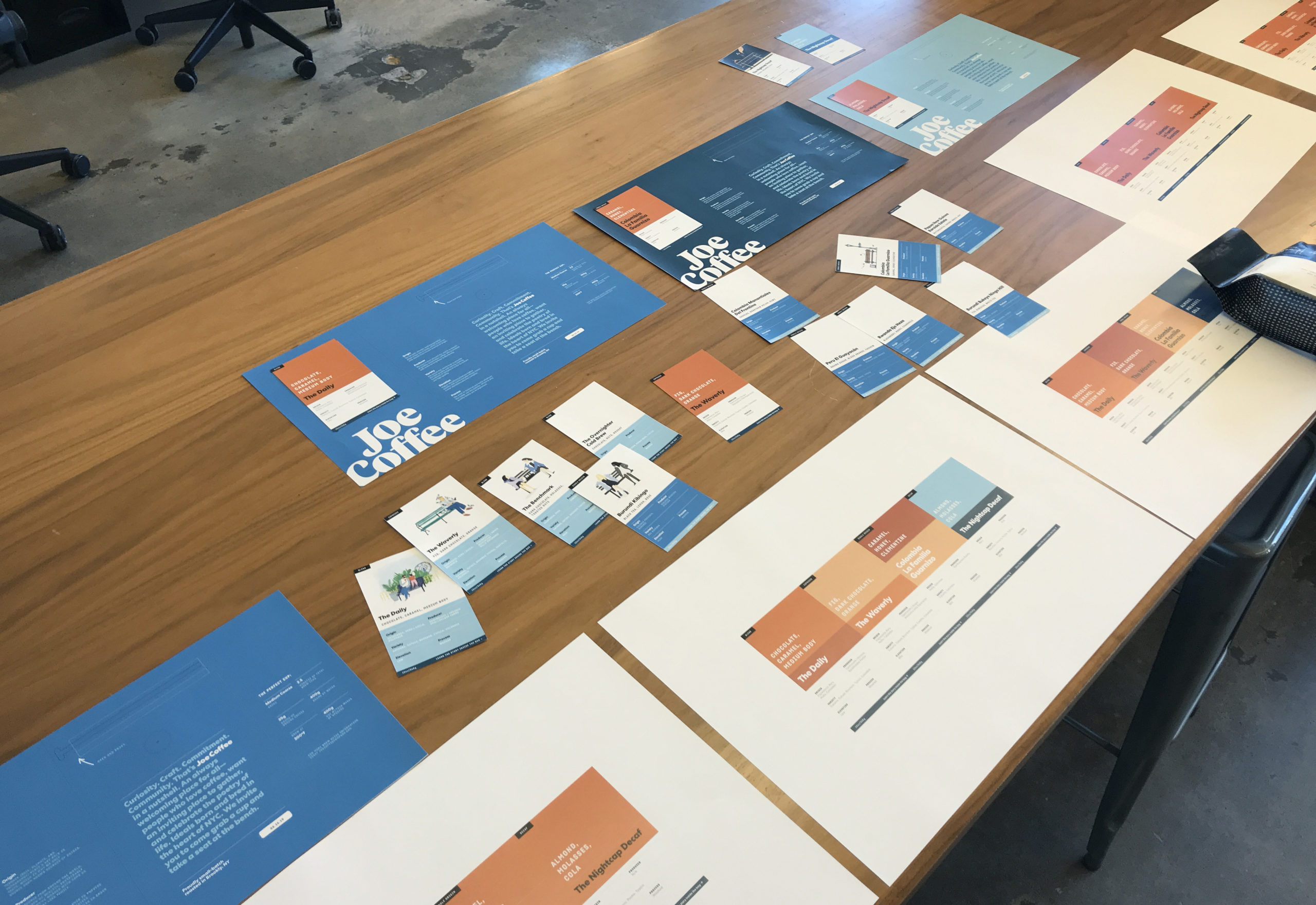
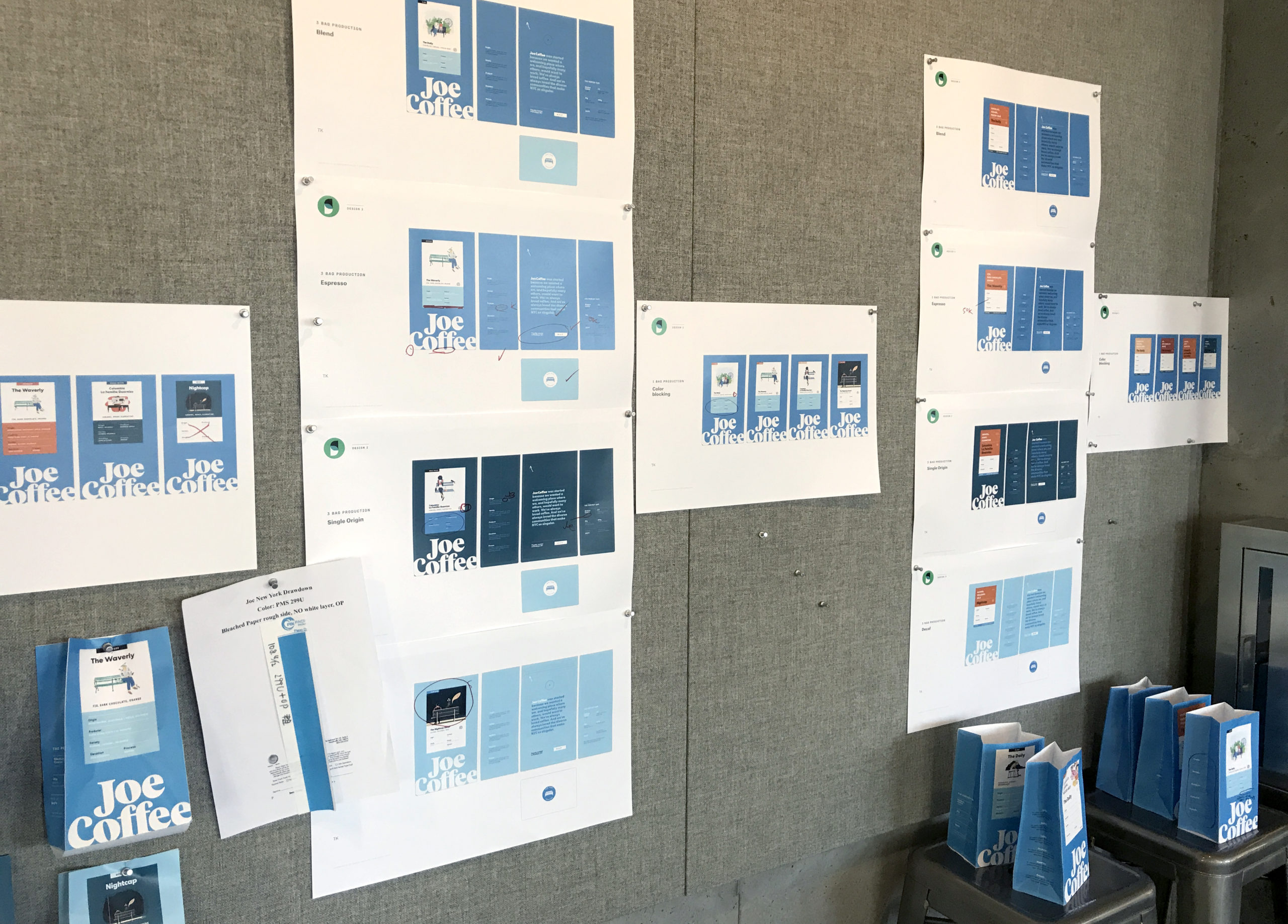
The bags are functional for the coffee expert, giving detailed information about the origin, producer, variety, elevation, and process of the beans inside. We included a Coffee Key on the side of the bag, that helps educate the coffee novice on why these details matter, and what they mean in terms of taste and quality. That duality was important for Joe. Joe wants to be approachable to all types of coffee drinkers, but display their knowledge and technical expertise in the industry.
Process
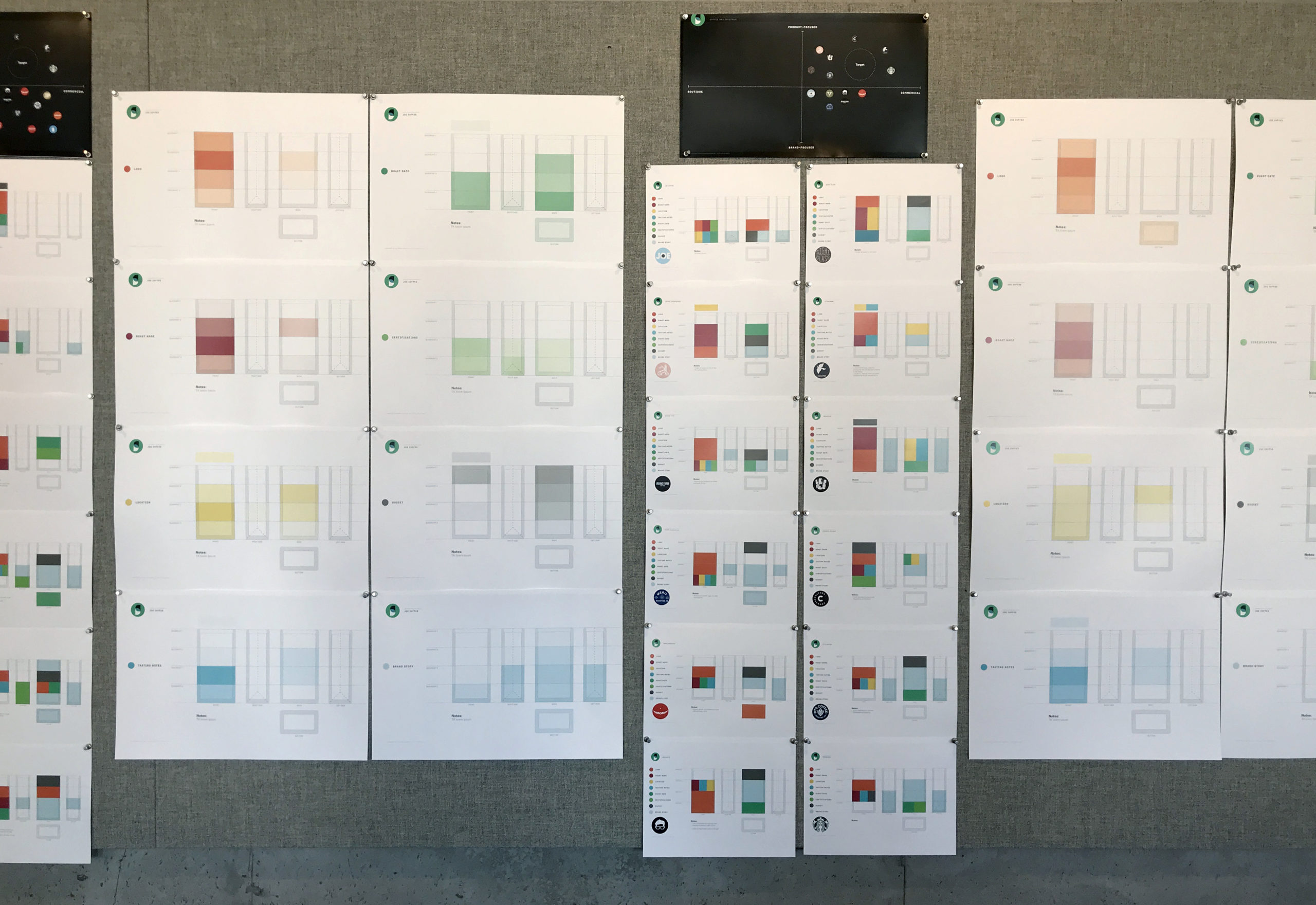
We worked collaboratively with the client, making sure their deep knowledge in both coffee, and their coffee loving customers, were considered in the design. For the coffee bags, we took an analytical approach, collecting a wide set of competitive bags, and creating heat maps for where information like logo, roast name, date, and brand manifesto typically appeared on bags.
The need to stand out in the market was paramount, so our explorations moved in a direction of ownable blues, and bold brand-moments that would cut through the noise.
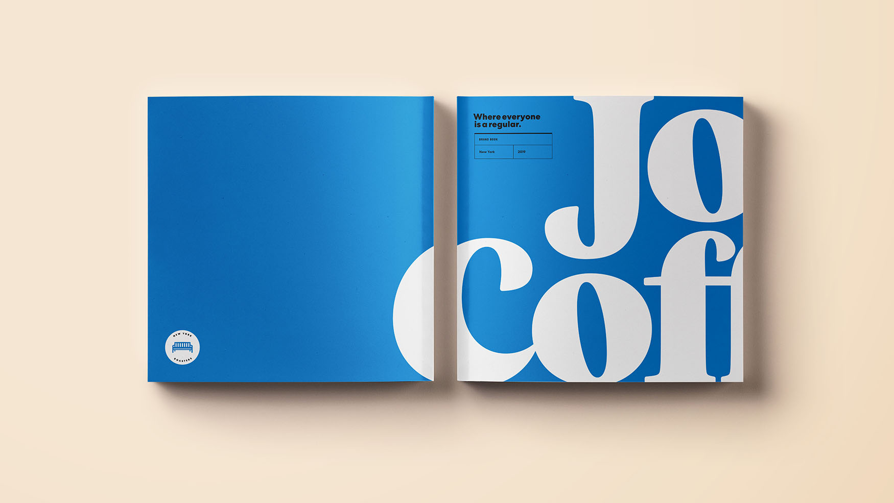
The result is a friendly, but smart, design system that welcomes both the coffee expert and novice into the same space, in hopes of stirring a bit of discourse and building on the already-powerful New York City coffee community.
Role: Art Direction, Design
Additional Art Direction/Design: Sean Wong, Habib Placencia
Copywriter: Lauren Tyrrell
Creative Direction: Allie Fisher, Scott Dadich
Selected Works
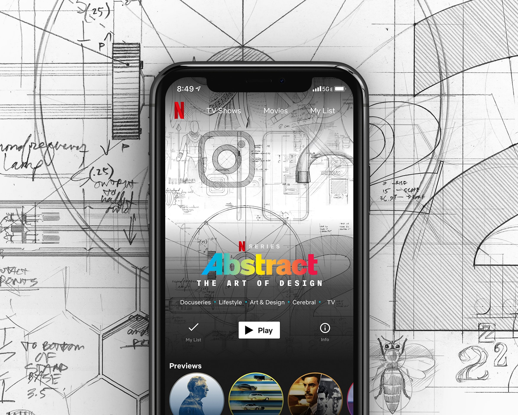
Netflix - Abstract S2 Key ArtArt Direction
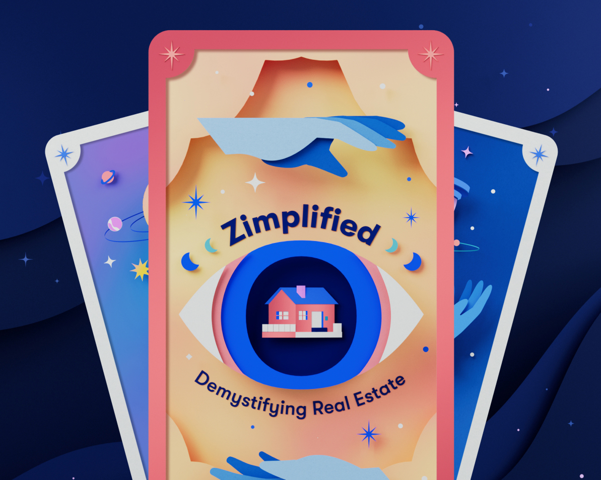
Zillow - ZimplifiedArt Direction
Joe Coffee Company - Brand Identity & PackagingArt Direction, Packaging Design, Brand Design
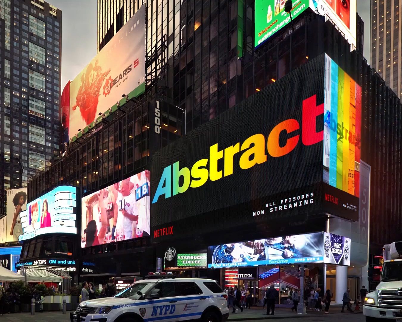
Netflix - Abstract S2 Times Square BillboardArt Direction
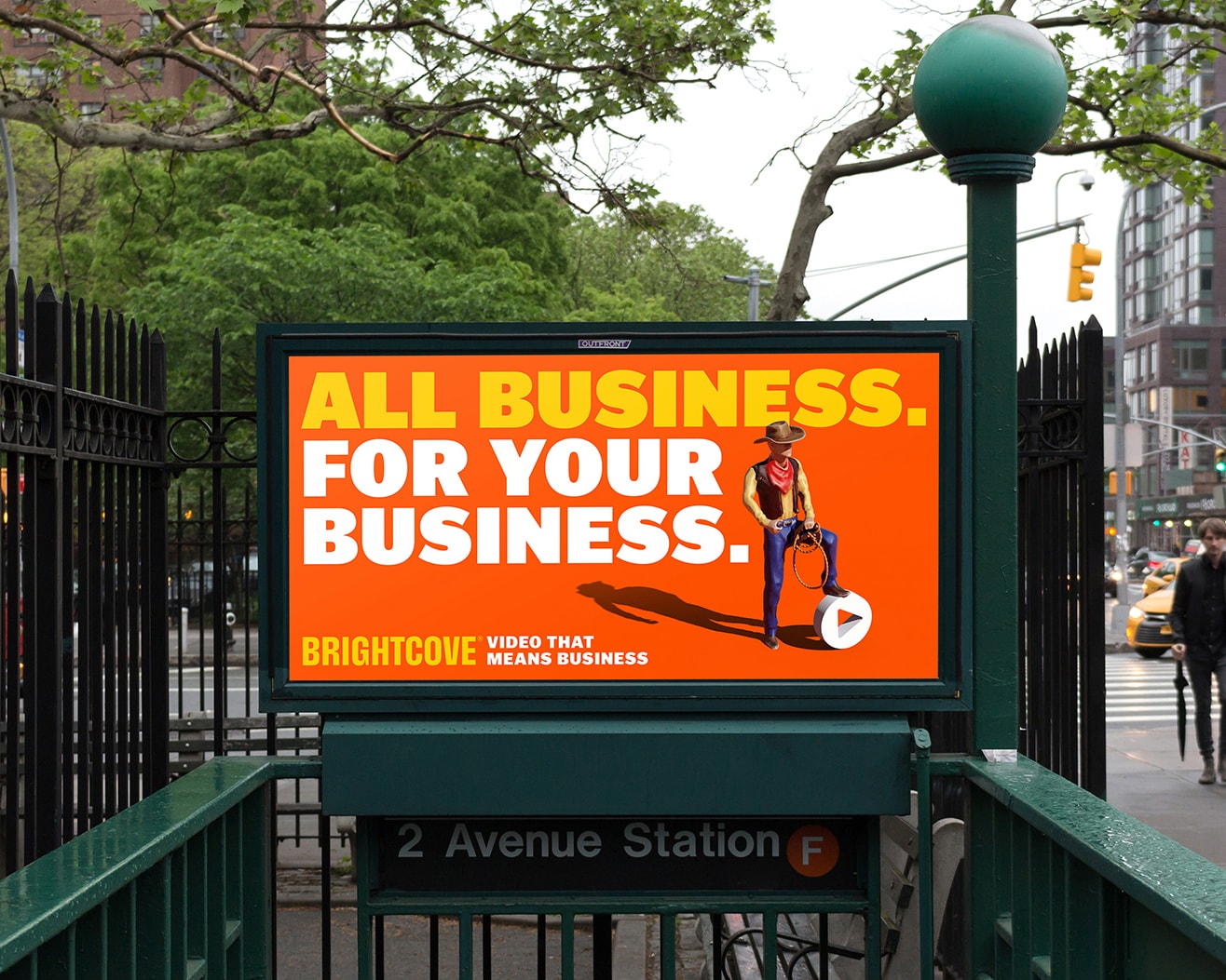
Brightcove - Brand Refresh CampaignArt Direction, Design
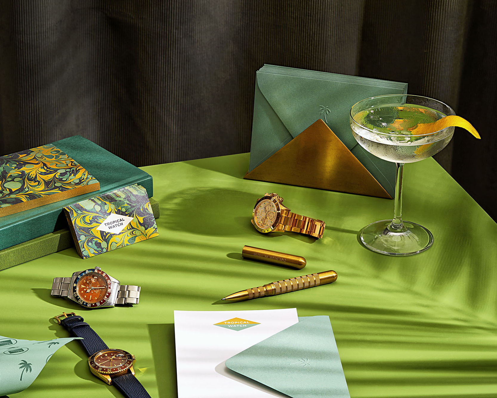
Tropical Watch - Brand Identity & WebsiteWeb Design, Brand Identity
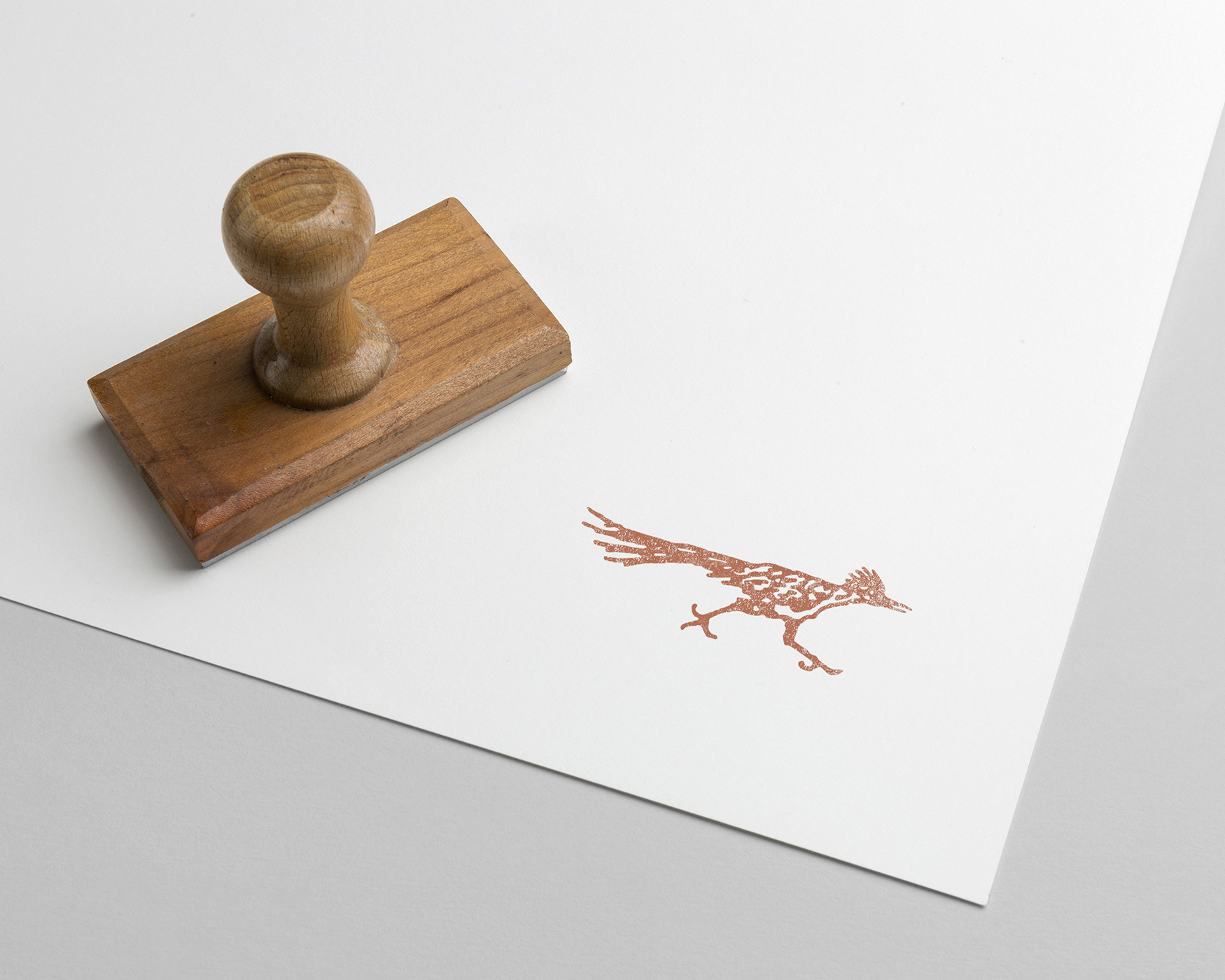
The Joshua Tree House - Brand IdentityBrand Identity
Palo Alto Networks - Prisma Launch CampaignArt Direction
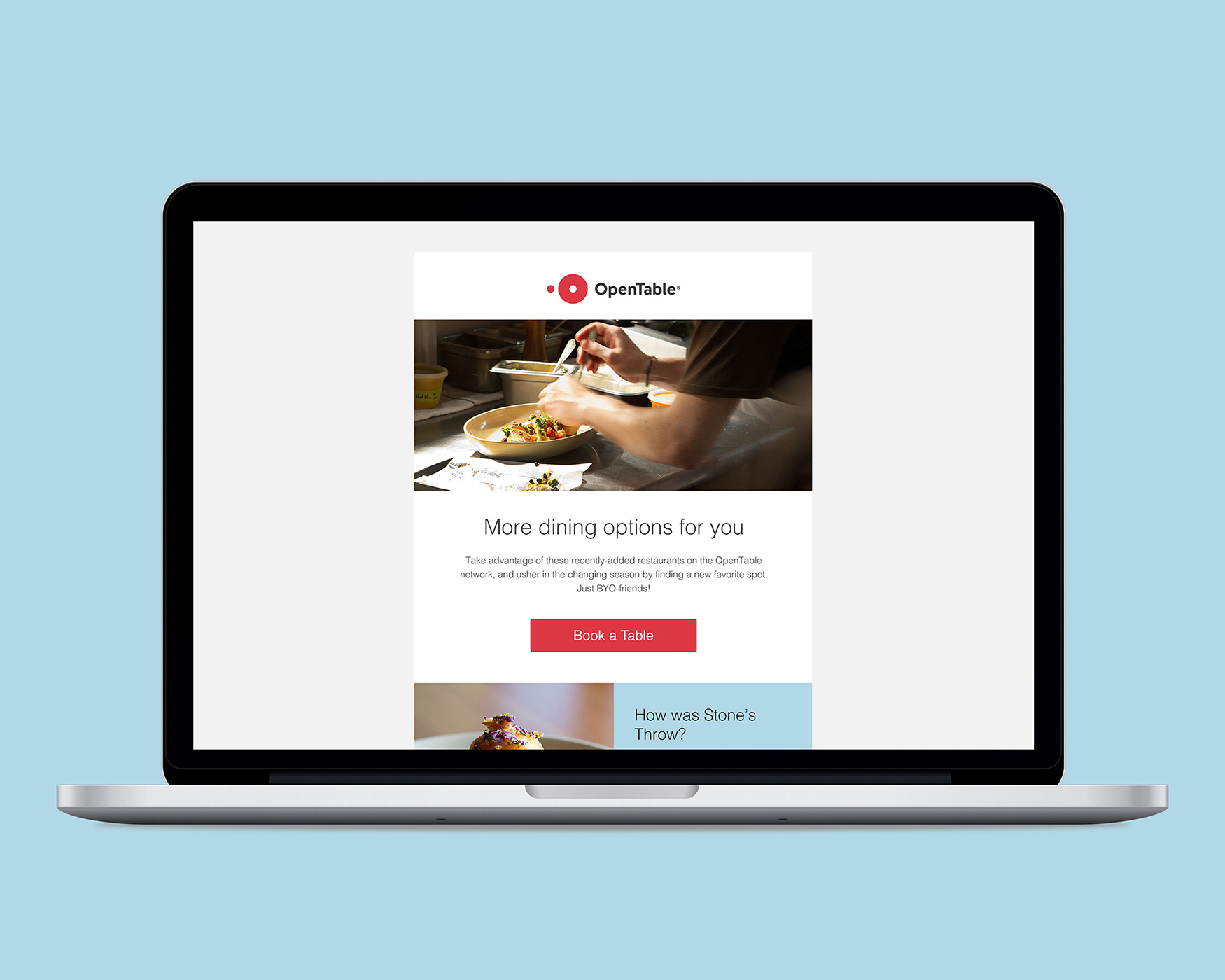
OpenTable - Consumer Email RedesignEmail Marketing
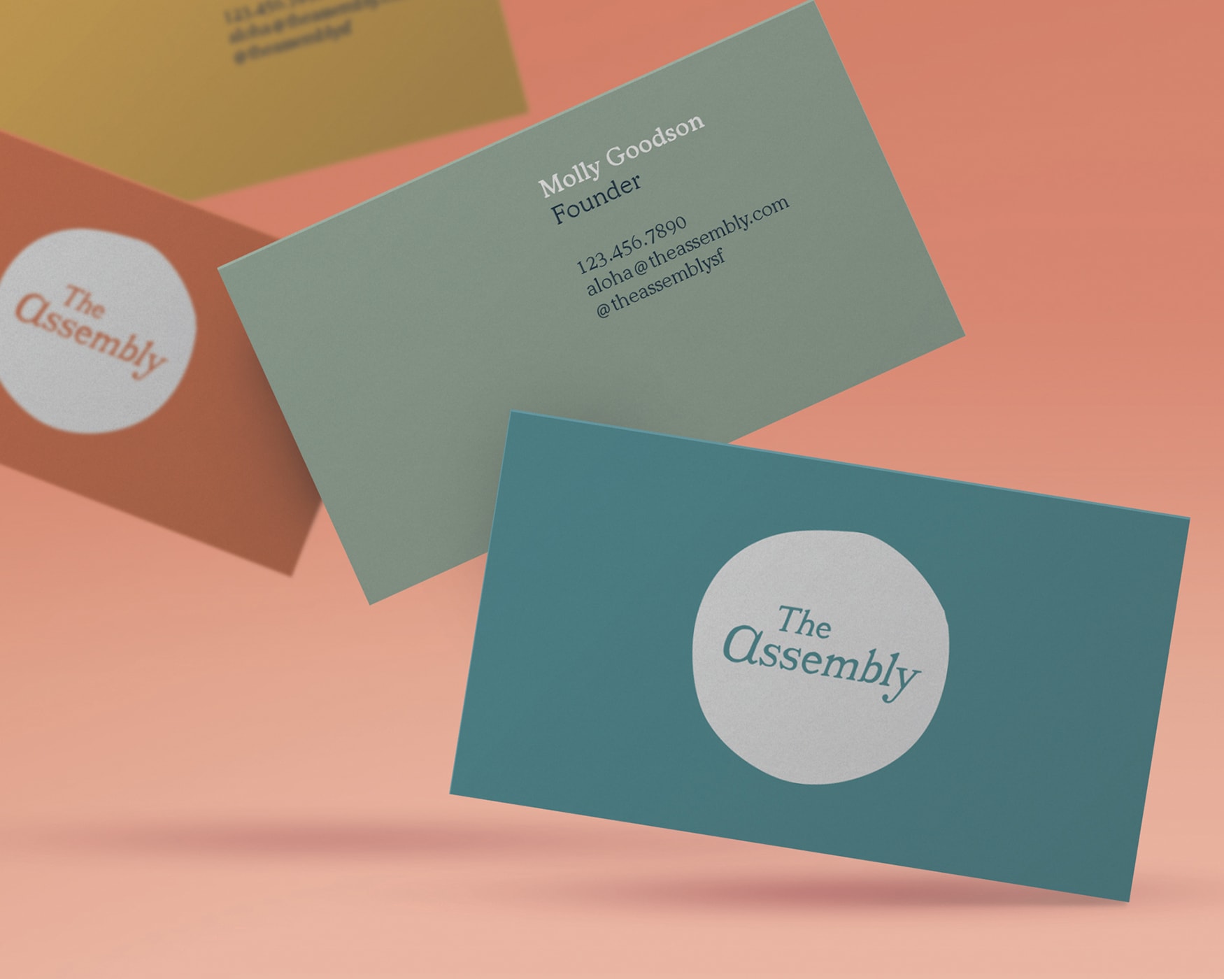
The Assembly - Brand IdentityBrand Identity
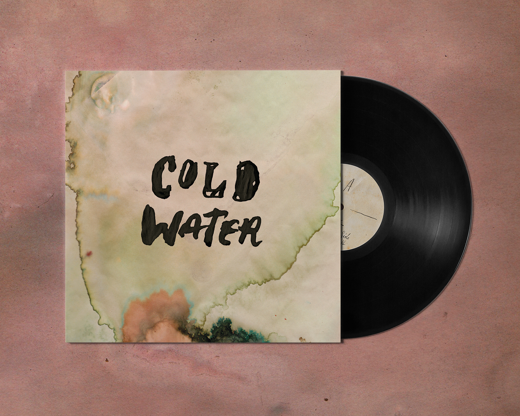
Cold Water Vinyl ReleaseAlbum Art
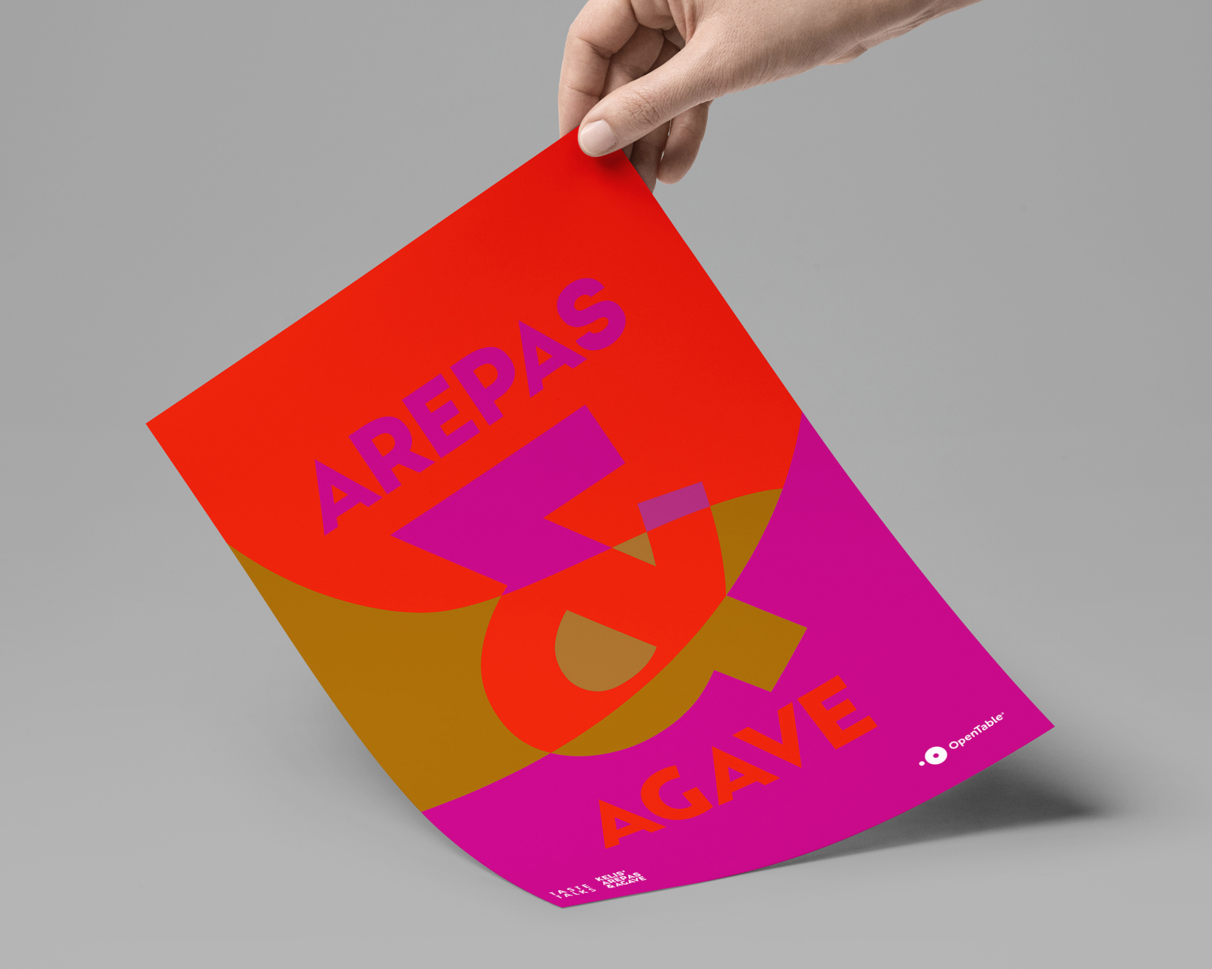
OpenTable - Arepas & AgaveEvent Branding
Send all project inquiries, secret family recipes, stock market tips, and new music suggestions to: